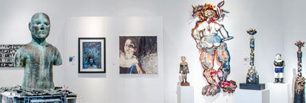
W. Keith and Janet Kellogg University Art Gallery

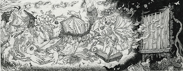
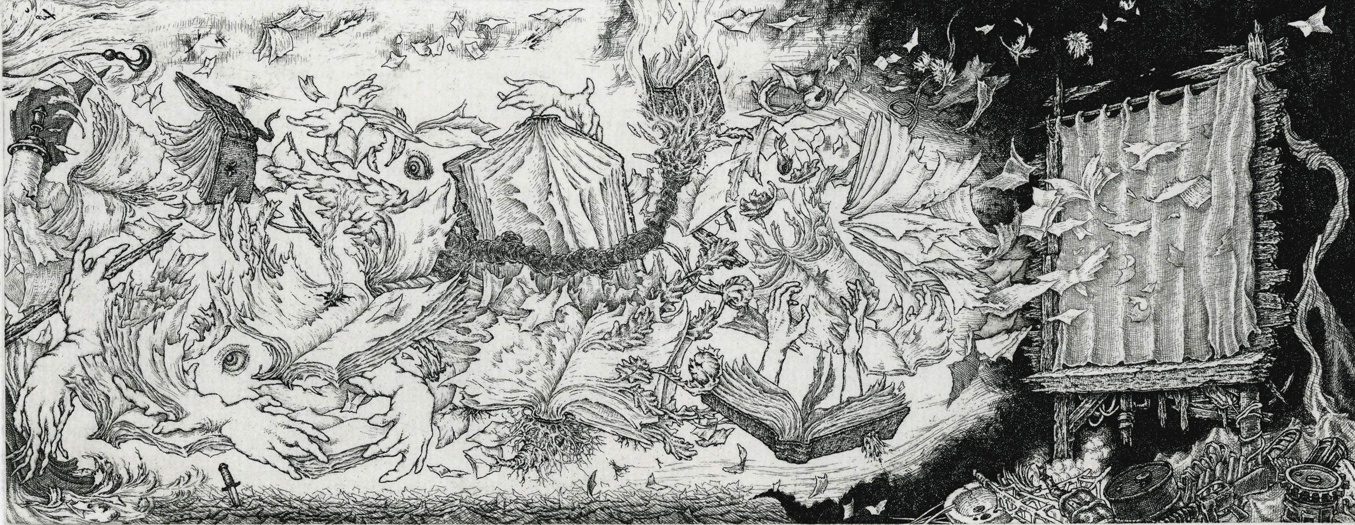
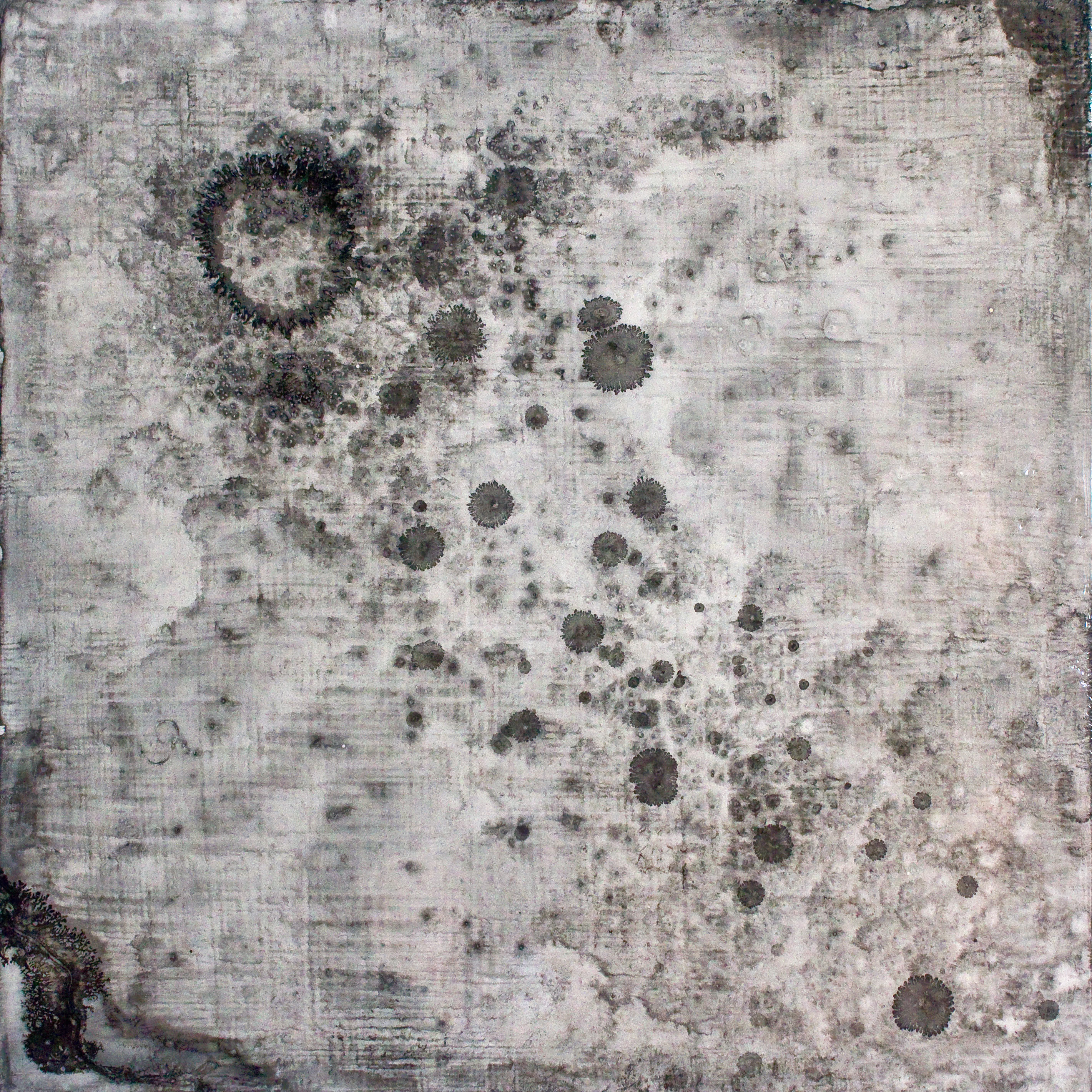
Ex Libris-In Absentia, 2014
hard ground etching
4" x 10.25"
Courtesy of the artist
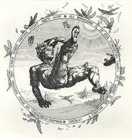
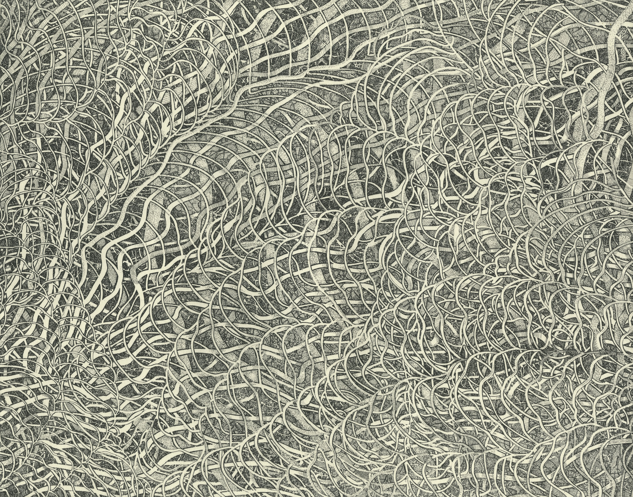
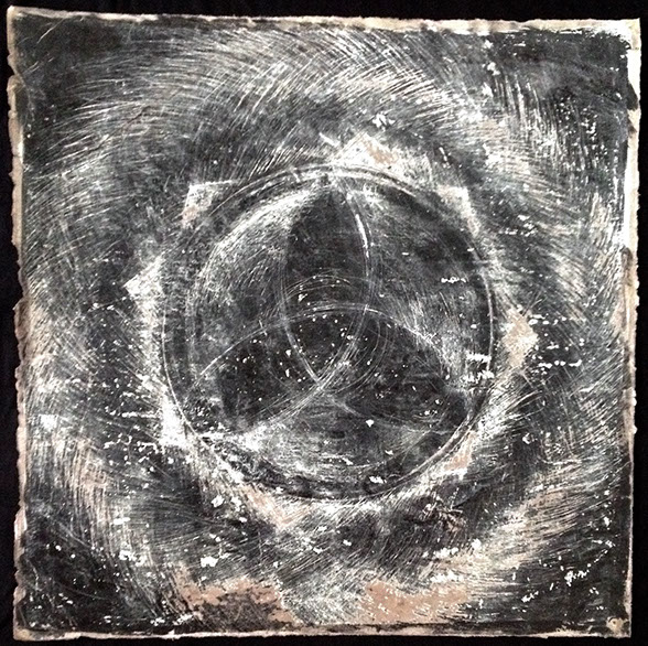
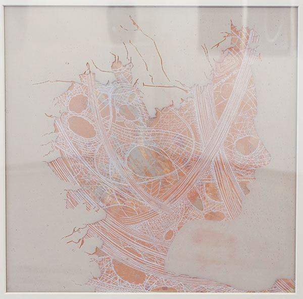
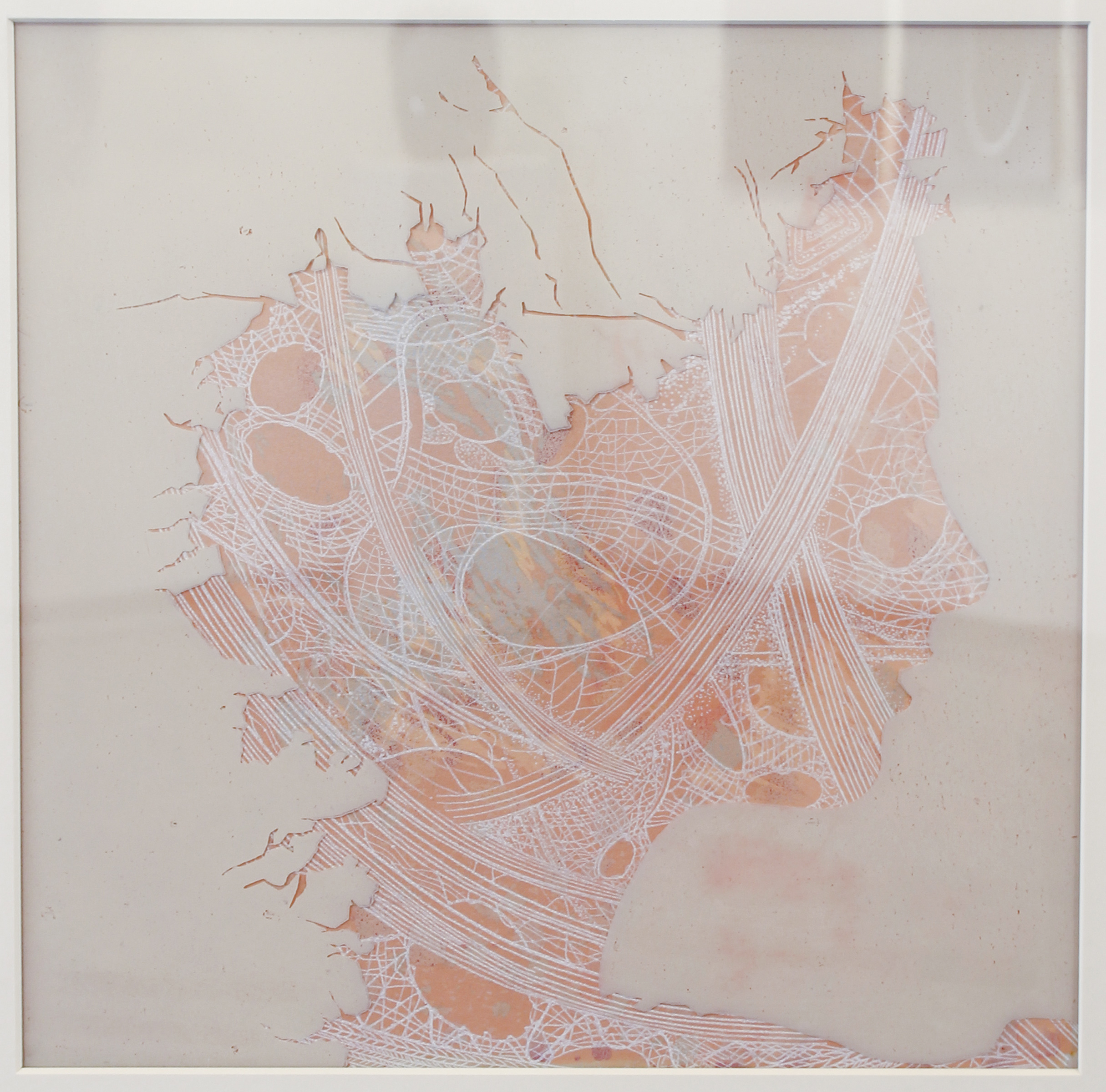
Too Close to the Sun, 2013
hard ground etching
6" x 6"
Courtesy of the artist
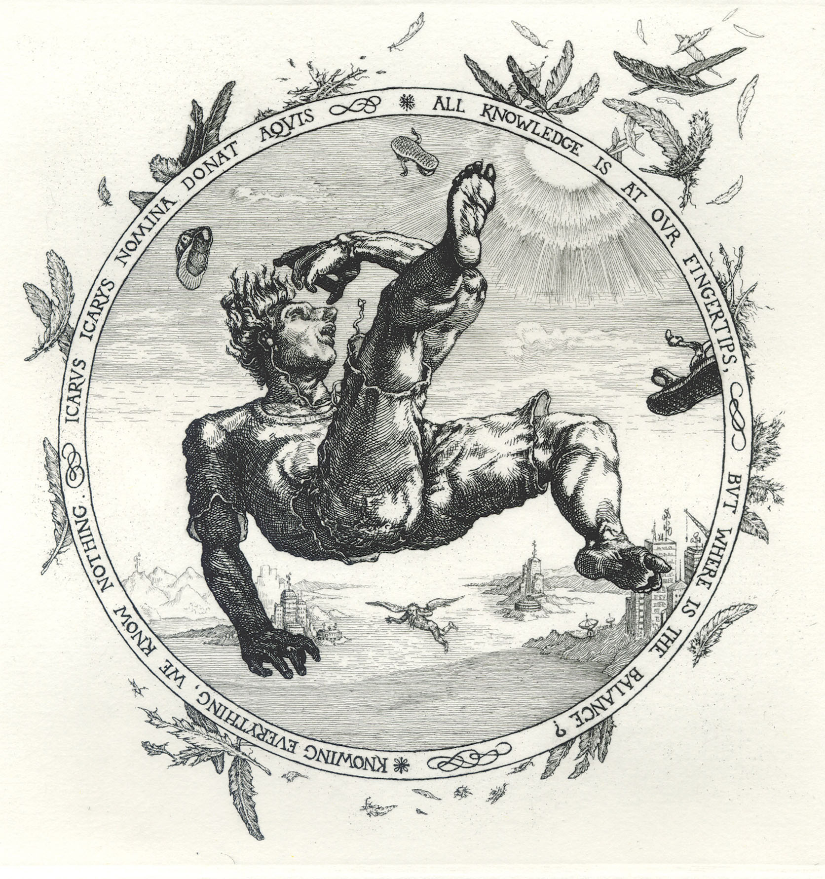
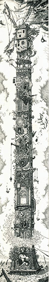
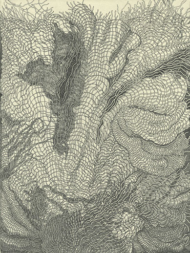
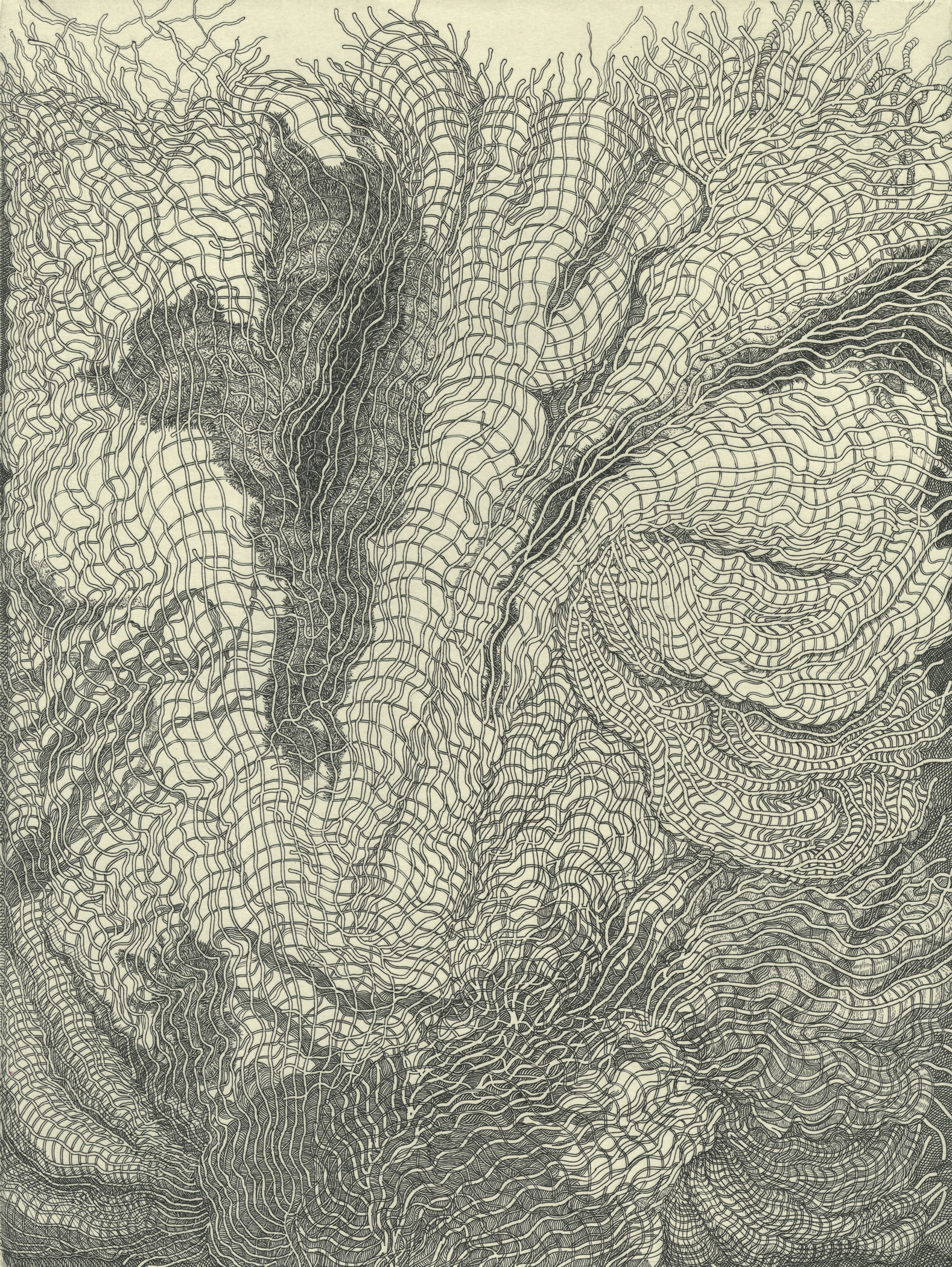
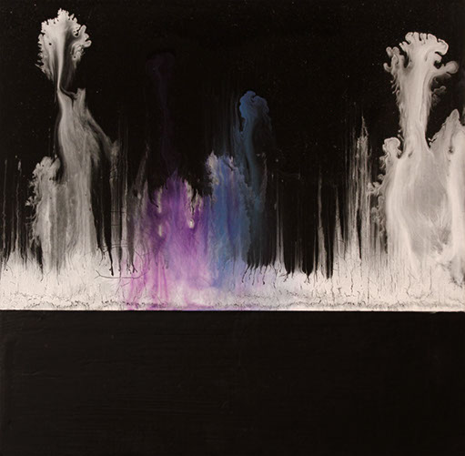
David Avery
We live in an age where words, images and objects seem to have been looted of meaning. In response to this state of affairs, I have come to think of the etchings I make as being miniature Rorschachs, the reverberations of oneiric gunshots acting upon the experiences and senses of the unsuspecting viewer, as well as the artist. Where do my ideas come from? The same place as everyone else’s—the brain. Or more precisely, they come from the interaction between experience and imagination that takes place within the brain, and I tend to think of my discovery of images in terms of receptivity rather than “inspiration” or “creativity”. If anything, my intent in pursuing a carefully worked out and highly detailed image is to work towards an inward goal unbounded by a set beginning or end, rather than trying to make some inner vision tangible. Even a simple nursery rhyme, once you start picking at it, will reveal layer upon layer of associations and further meanings. I consider my work successful to the extent that it continues to generate multiple interpretations, releasing this capacity for receptivity to the mysterious and the ambivalent that reflects the essential vibrancy of life.
Obeliscolychny, 2013
hard ground etching
27.75" x 5"
Courtesy of the artist
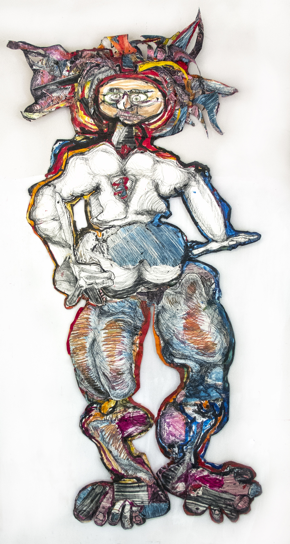
Ann Bingham-Freeman
My art is always driven by life drawing, gesture and contour. I am interested in personal authentic expression reflecting my life experiences. Originally trained as a print maker, I learned to work into the plate to create a deep experience between the plate or block and paper. I love paper and clay. Later in my life, I learned to weld and returned to working with clay.
9 Foot, 2014
etchings, ink, acyrlic, glue and paper
122" x 55" x 10"
Courtesy of the artist
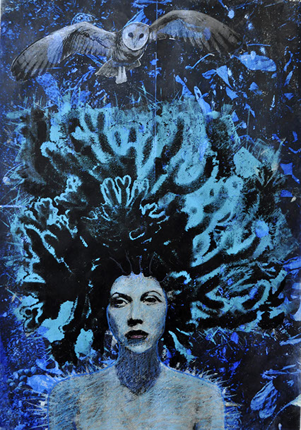
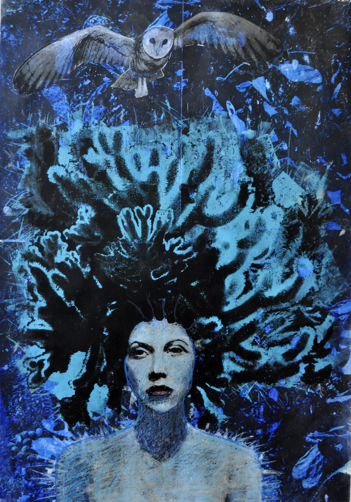
Leslie Brown
The archetype is something that has continually interested me, in that objects or imagery imply meaning beyond the physical sense and particular icons have been repeated historically in different cultures and ages. The author, Clarissa Pinkola Estes says “the archetype fertilizes the mundane world." I try to unite the mystical with the mundane and embrace the very feminine, intuitive process in the act of image making.
My images deal primarily with women and everyday objects and scenarios that combine the object, the everyday, the spiritual and the sacred. I have created a personal iconography with: woman as hero, virgin, temptress, goddess, mother, and crone. The image of the modern woman merges, with the archetype in my work
The voice of the feminine spirit in fine art is novel in this age and I hope my work has the opportunity to be part of an empowered feminine.
Blue Moon of Artemis, 2015
from the Luna’s Secrets series
mixed media monoprint
30" x 22"
Courtesy of the artist

Judy Dekel
Leaves are a recurring element and image in much of my work. Their forms, whether skeletal or in full shape always intrigue me. You can see all of the structure and almost vein like lines in these leaves which have been made bare. They only show what is deep within them.
This is what interested me in making these prints. You could almost see through them.
Torn Leaf, 2013
monoprint
22" x 30"
Courtesy of the artist
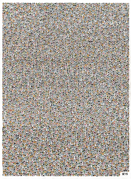
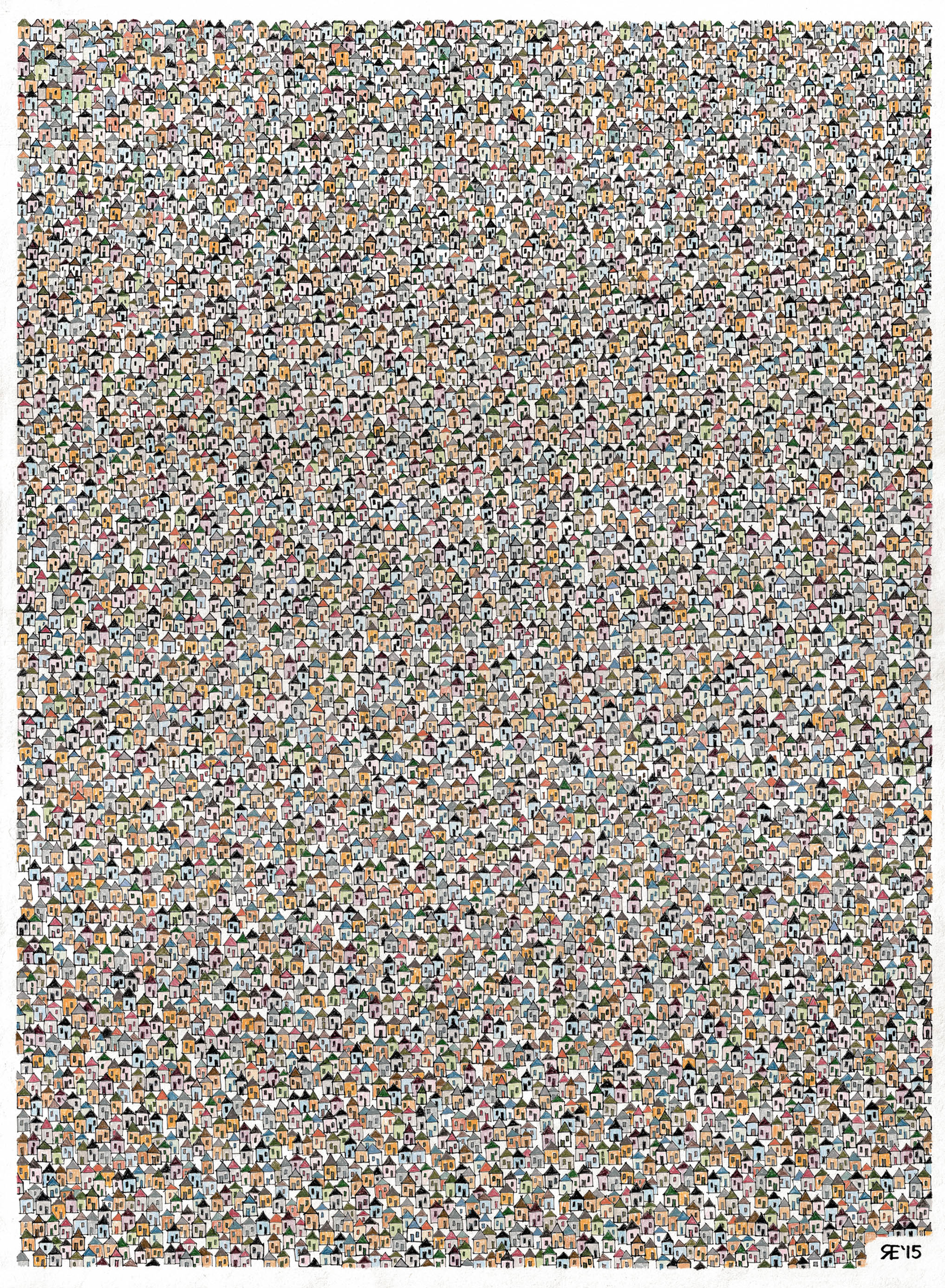
Roland Escalona
Close Quarters III is my third installment of a series that started as a sketch entry for the Architectural Record Magazine’s 2014 Sketch Napkin Competition in which I won the non-registered architect category. The series evolved from ink on a cocktail napkin, Close Quarters I, to ink on 18 x 24” drawing paper, Close Quarters II, to ink and colored pencils on 22 x 30” drawing paper, exhibited here. Now I am currently finishing a fourth version, one that has 3D and lighting effects. I am about to start on the fifth, and there is already an idea for the sixth installment of the series. Who knows how many more are to come?
I grew up in Manila, Philippines, where shanty housing is always part of the urban landscape. The memory of that landscape stayed with me and it became the subject of my college senior thesis. The idea for the Close Quarters series struck me after I came across that same thesis paper while cleaning up my files. Using a similar meticulous precision of photomosaic, one of my hobbies, the Close Quarters series became my artistic expression of the dense urban landscape I grew up seeing in my native country.
Close Quarters III, 2015
ink and colored pencil on paper
30" x 22"
Courtesy of the artist
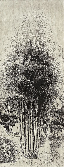
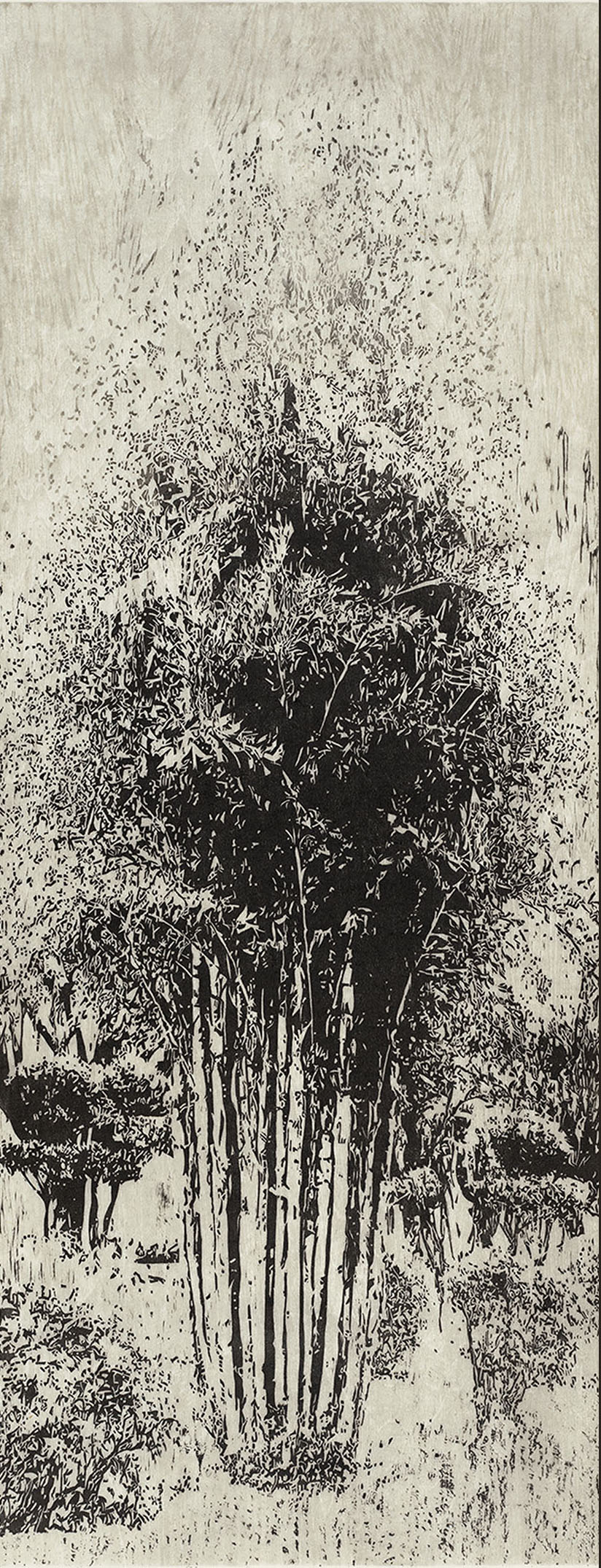

Into the Mist, 2015
woodcut
50" x 22"
Courtesy of the artist
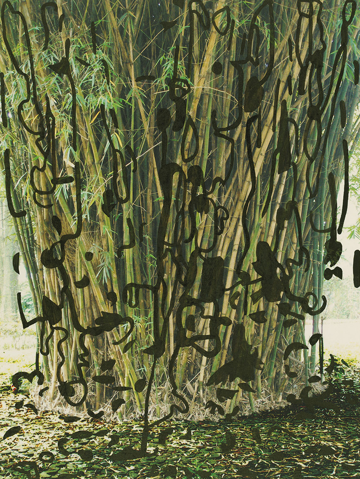
Bambusa Vulgaris, 2014
u.v. digital, stencil on Kozo paper
30" x 50"
Courtesy of the artist
Barbara Foster
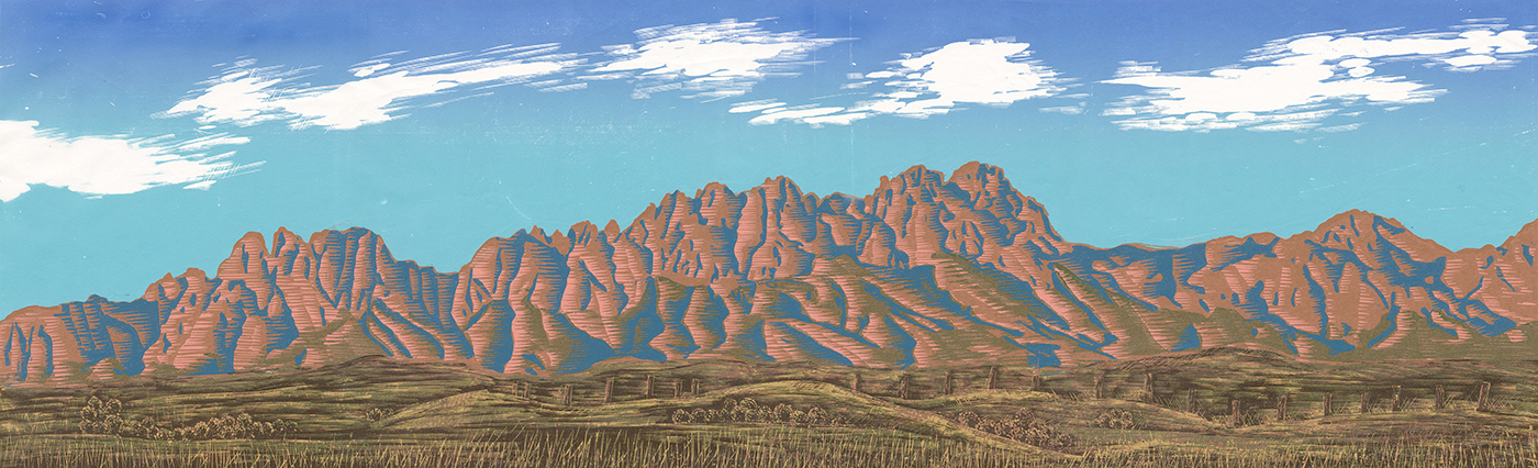
Over the past fifteen years my work has addressed the fragility of the landscape, whether it is the Nevada proving grounds, deep-sea terrain, reclamation areas, corporate agriculture, or Taiwan urban gardens. And now with the planting and harvesting of trees as a way of looking at the resurrection of the previously blighted or the implications of the unpredictable, the work has become more subtle, in black and white relief prints, Sumi-ink drawings, hybrid digital/relief prints, and carbon prints on Japanese papers. Ink, paper, photographic and specialty materials, and software applications combine to elicit a response that is not immediately obvious, finding kinship among materials and subject.
My projects intend to reshape the visual dialogue on these topics by moving the conversation and practice to reflect the landscapes that have claimed new identities through process yet are still imbued with the patina of intention, history, and event.
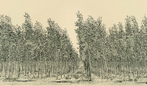
Sustainable Tree Farming: Endless Poplars, 2013
woodcut and Sumi ink on Okawara paper
32" x 26"
Courtesy of the artist

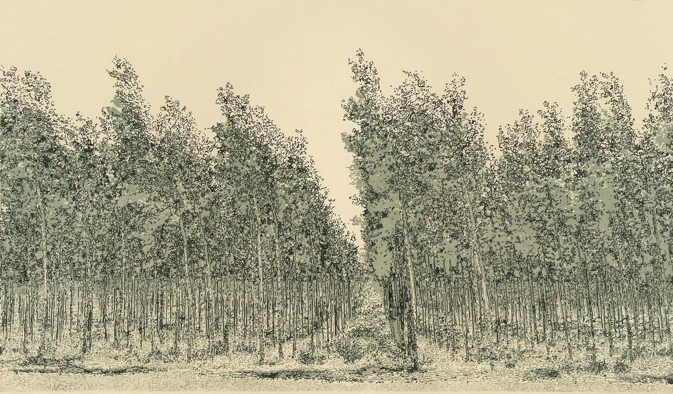
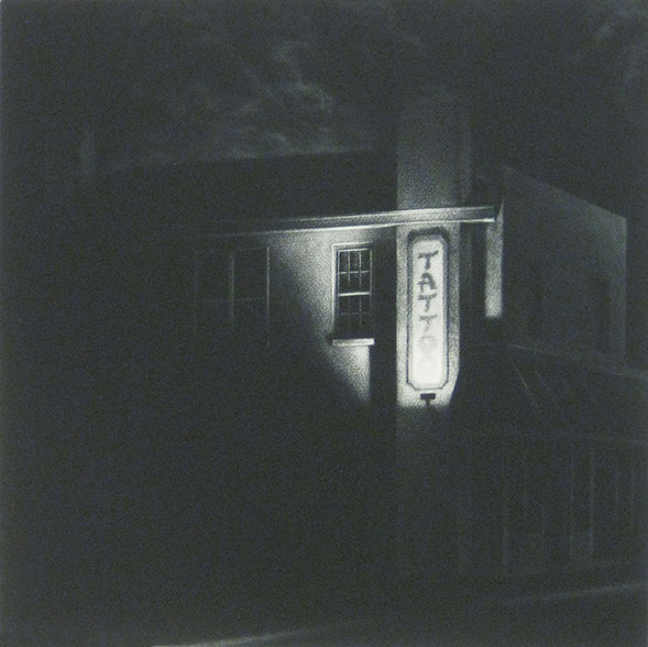
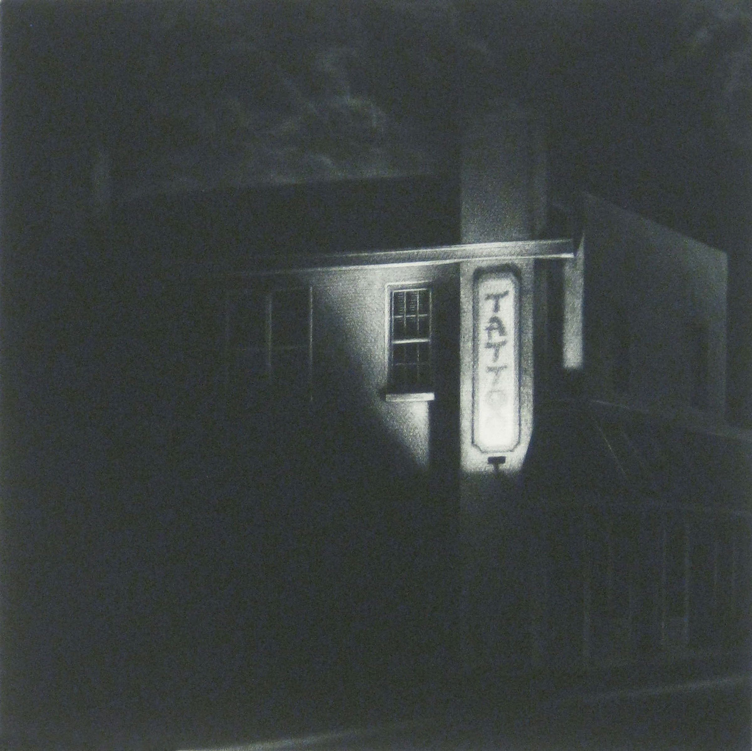
Donald Furst
There is mystery in the mundane.
Afterglow, 2013
mezzotint
8" x 4.5"
Courtesy of the artist
3:20 a.m., 2015
mezzotint
12" x 12"
Courtesy of the artist

Summer Furzer
I usually prefer to create artwork using acrylic paints on canvas. However, due to recent experimentations with ink on paper, I have been forced to limit my color palette and direct more focus on smaller, technical details. The content of my current work has been influenced by my experience as a college student and my Southern California surroundings.
Gluttony, 2015
Micron and Sharpie pens on paper
24" x 18"
Courtesy of the artist

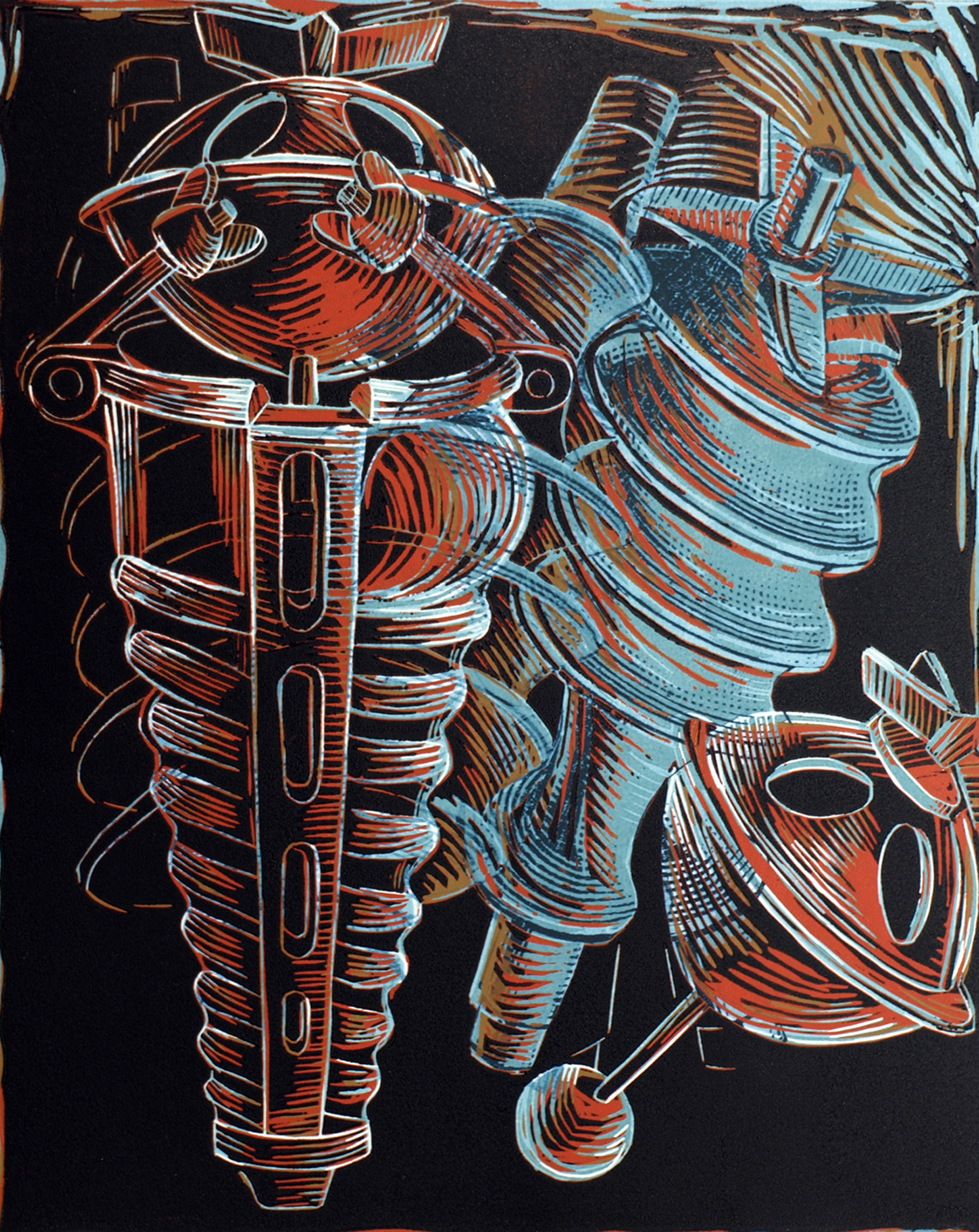

Jessica Gondek
The primary focus of my work is abstract, stemming from an interest in technology, geometry, nature, and human invention. Over the past decade, my work has been concentrated in the areas of painting, printmaking, digital printmaking, and drawing.
My recent work endeavors to blur the line between hand and machine juxtaposing woodcut and digital print. The Enterprising Machines series are works inspired by machine aesthetics that reference common tools and domestic utilitarian objects. My process begins with digital manipulations from vintage consumer catalogues published in the early 1900s for Pratt and Whitney Company tools, and Enterprise Manufacturing Company, maker of domestic gadgets. The digitally printed elements I compose recall blueprints or plans, and create a foundation for the modification of the context of these implements. Working from observation of actual objects allows for transposition and mutability between layers of printed and observed information. The objects explored are simultaneously transformed denying their original functional purpose and asserting an animated physical presence and internal narrative.
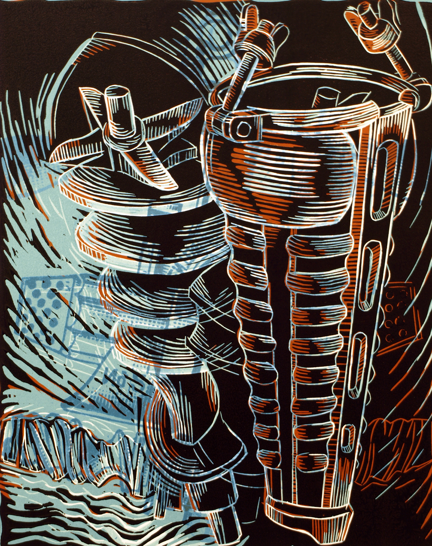
Enterprising Machine I, 2013
woodcut and digital print
20" x 16"
Courtesy of the artist
Enterprising Machine II, 2014
woodcut and digital print
20" x 16"
Courtesy of the artist


David Graves
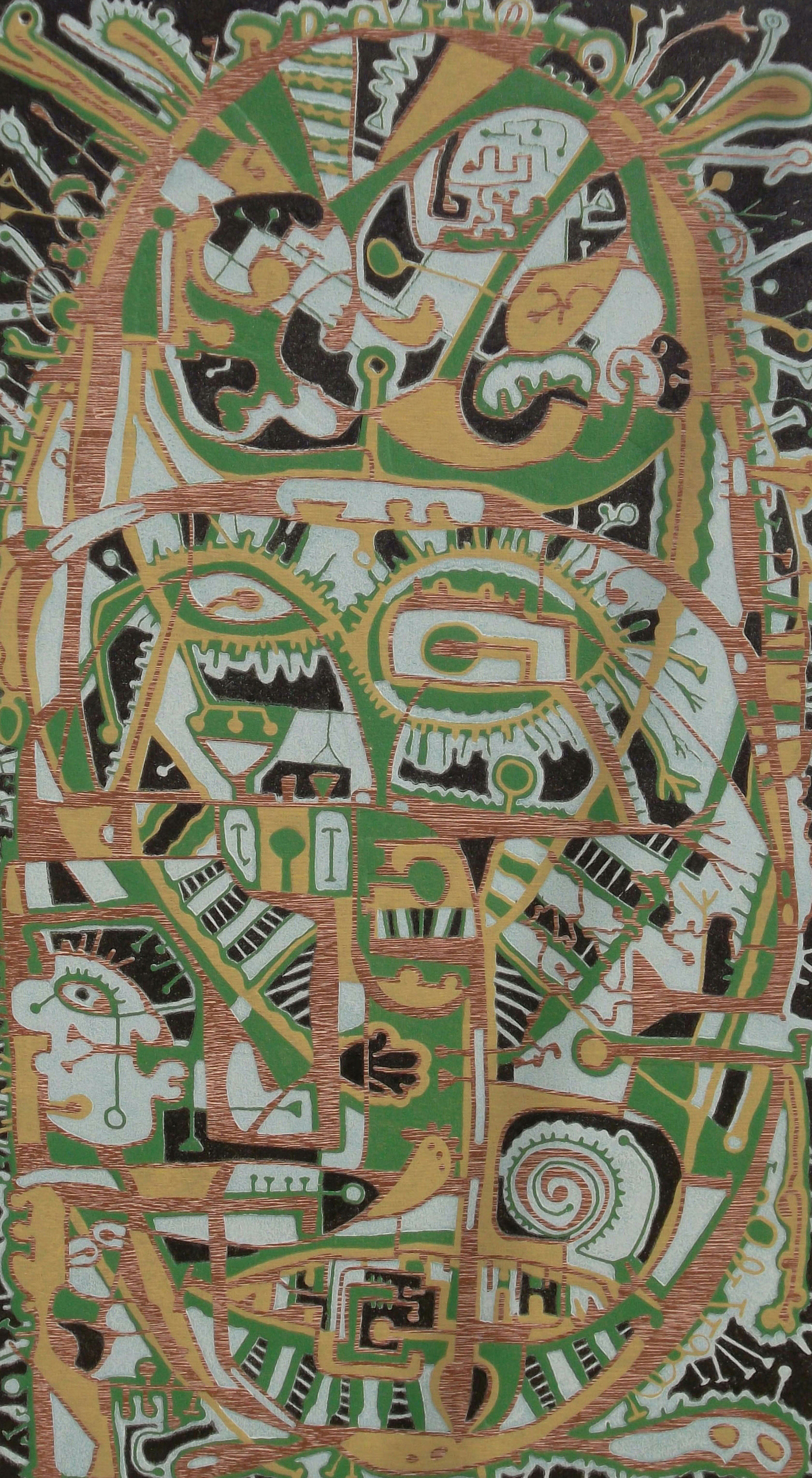
Much of my work is based on my early training and experience as an archaeologist and anthropologist. I have liberally abstracted symbols used by anthropologists to describe culture. I also draw heavily from received information about contemporary culture including aerial drawings, biology, technology and of course art history.
Masked Mask, 2015 (left)
reduction woodcut with woodblock transfer
28" x 15"
Courtesy of the artist
Ascending Descendants, 2014 (right)
reduction woodcut with woodblock transfer
27" x 15"
Courtesy of the artist
Synaptic Evolution, 2014
etching
10.5" x 13.5"
Courtesy of the artist
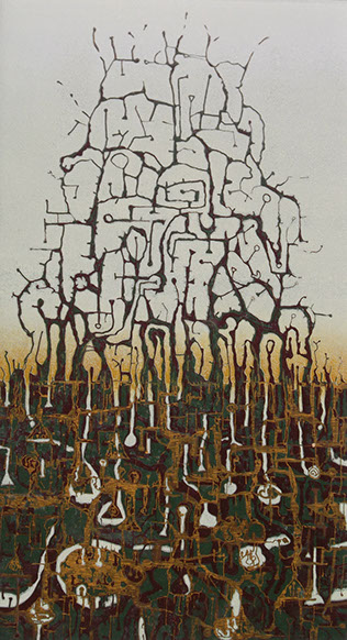
Karla Hackenmiller
I have been exploring the essence of the drawn mark as a parallel for the most basic of thought processes, the firing of synapses. A drawn line forms a connection between two points, just as our thoughts are the paths between a set of neurons. In the creation of these pieces I work spontaneously, developing an increasingly complex web of systems in the process. Each mark is affected by multiple, interlocking systems and forces that grow out of the ongoing, subconscious process of mark-making.
Currently, I am creating drawings in collaboration with a plotting cutter. Similar to the electrical stimuli of the brain, the plotter is driven by electrical pulses in response to data input. The machine interprets my images with its own language. I respond to those marks with additional hand drawing, often while the machine is in motion. These two, vastly different electrical systems contribute to new visual assimilations in a hybrid of digital and analog outputs.
Synaptic Sprout, 2014
etching
12" x 9"
Courtesy of the artist

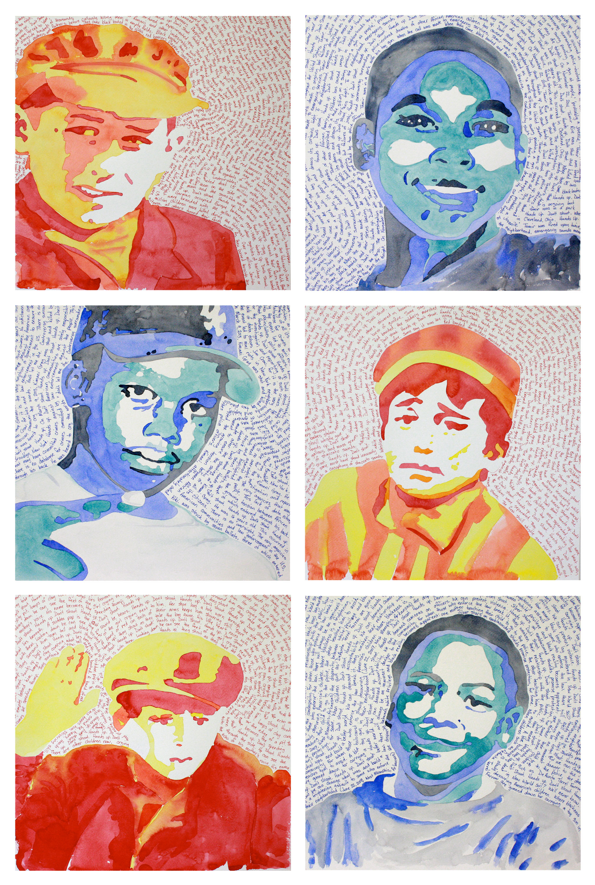
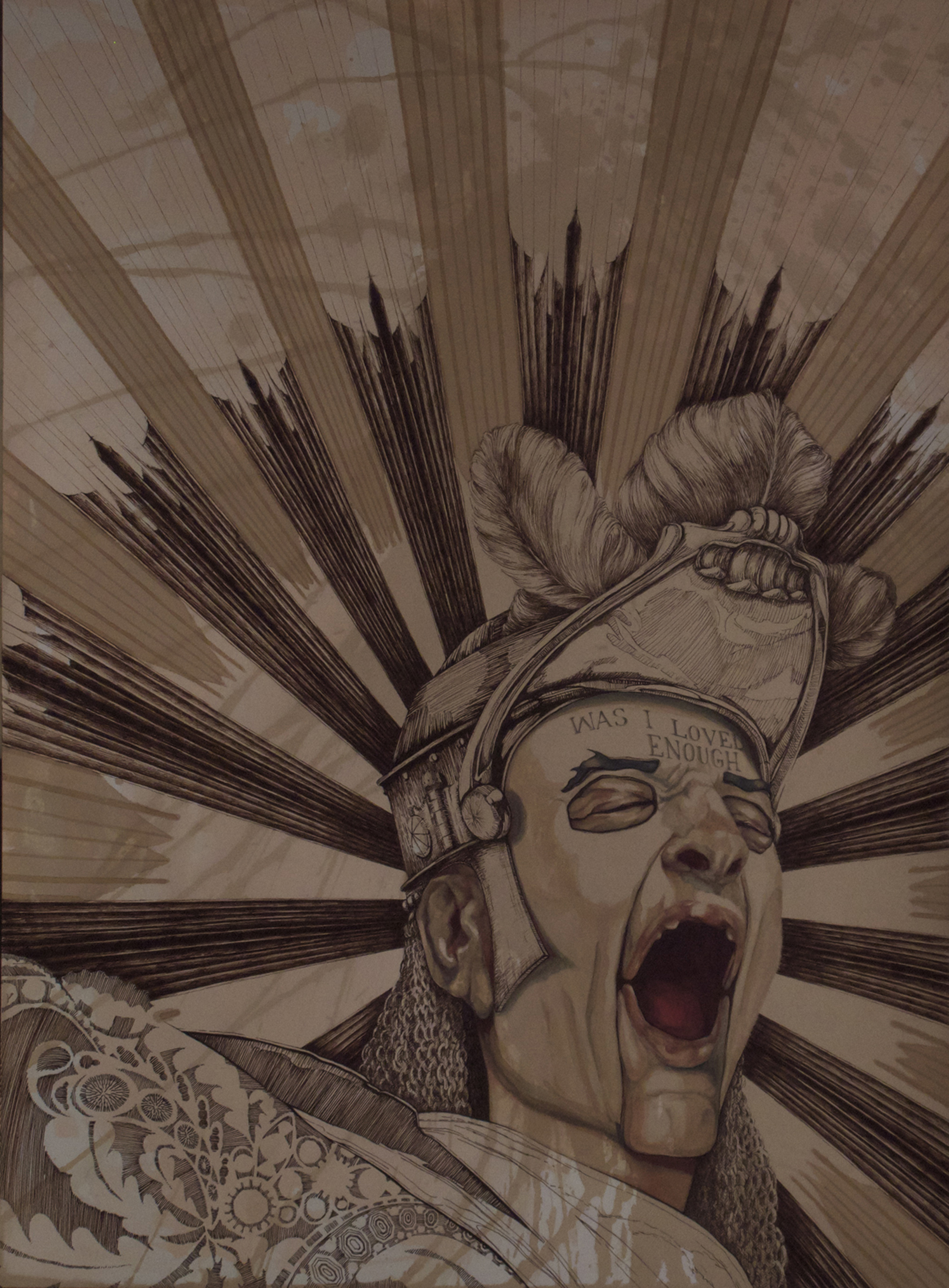
K. Ryan Henisey
I was starting college when Matthew Shepard was lured, beaten, tortured and left to die. At eighteen, I was afraid of people finding out; I was horrified that something like this could happen. But I was also blessed. My parents became protective and friends became supportive. I hadn’t done anything – a cute, skinny boy had been killed a thousand miles away and I had been cocooned. At thirty-five, I am no longer afraid, but the killings still occur.
#ArtToEndViolence is an ongoing series dedicated to highlighting and honoring the lives of those who have been lost to racism, homophobia, transphobia and other iterations of bigotry and hate that occur throughout the world. These mixed media works superimpose the graphic qualities of pop-art with the serious and deadly subject matter of human violence.
Selections from #ArtToEndViolence have appeared in galleries and exhibitions throughout California. The titular piece was chosen for the Fine Art Exhibition at the California State Fair, 2015. Narratives for each piece can be read on the artist’s website.
#BlueHolocaust, 2015
from the #ArtToEndViolence series
watercolor and Sharpie pen (6 piece set)
62" x 42"
Courtesy of the artist
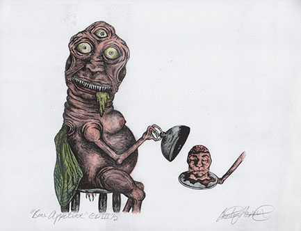
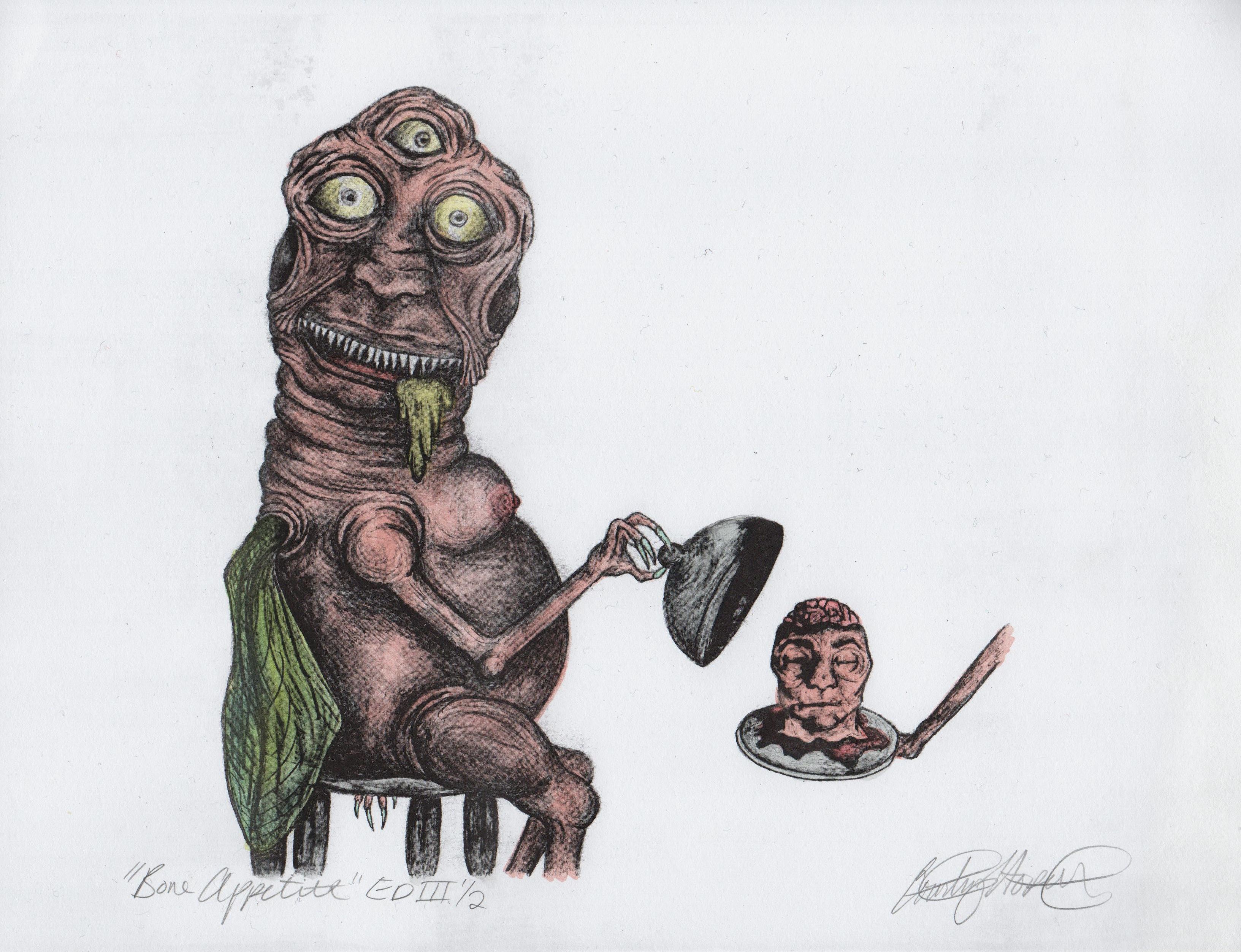
Bone Appetite, 2015
offset printing, graphite and watercolor
8.5" x 11"
Courtesy of the artist
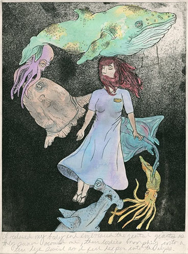
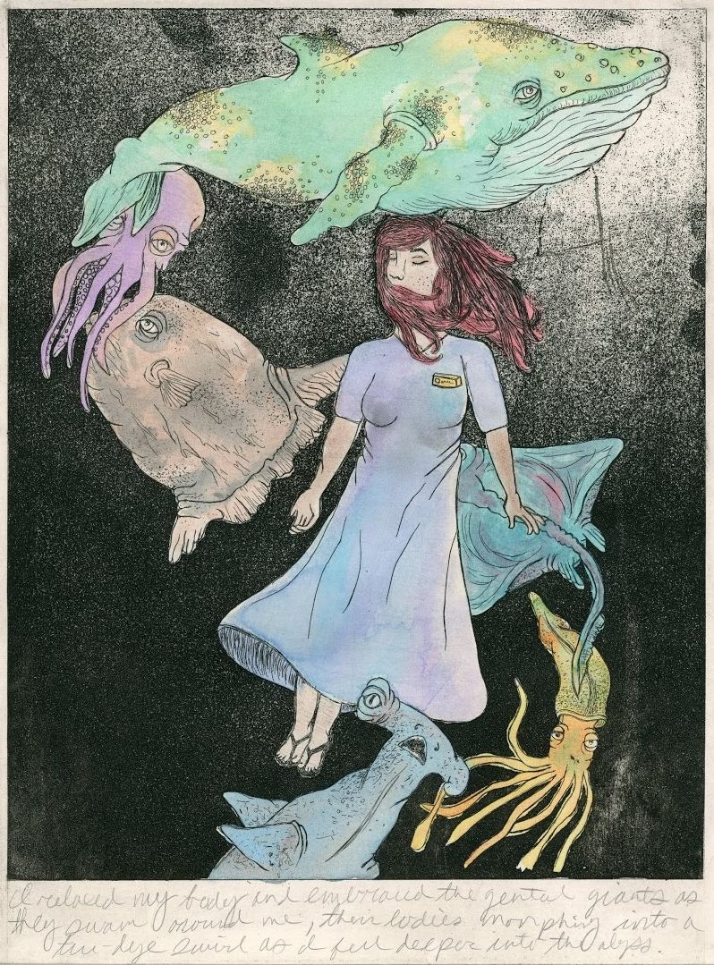
Drowning, 2015
zinc etching, aquatint and watercolor
12" x 9"
Courtesy of the artist
Courtney Hockett
Drowning was created as a result of researching how to incorporate creative literacy in visual arts using a cross curricular approach. During my studies, I experimented with the writing technique of flash fiction and focused on creating a story that included aspects of Magic Realism that worked cohesively with the use of extreme detail. I then analyzed the story’s contents and chose a climactic scene to illustrate and included a sentence from the event within the actual image. I used my knowledge in the field of printmaking to create an illustration that acted as a narrative producing an image that portrayed a magical feeling through movement and color. The illustration was created using the technique of intaglio, which I added aquatint to, providing the work with a better sense of depth. The visual content of this image was inspired by the Southeast's largest dry aquarium located in the Museum of Coastal Carolina in Ocean Isle Beach, NC, and the scenarios I encountered at the facility during my time as an intern.
Bone Appetite was created using the technique of offset printing and includes a total of eight prints, with this being one of two in the third edition. This illustration is limited in the amount of images produced and future prints will not be created due to the fact that the plate was destroyed because of the improper application of gum arabic. As a child I grew up helping my grandmother in her newspaper company, Miller Printing and Design in Shallotte, North Carolina, and had the opportunity to be exposed to various printing machinery on a commercial level. Because I am still a novice in this field, while learning how to use a plate maker I encountered small errors which ultimately resulted in the later destruction of the plate as previously mentioned.
The content of this illustration was inspired by the 1958 horror movie The Fly in which I created my own version of a mutilated, human-fly creature. The third eye is a symbol I choose to repeat throughout artwork I base off the 1950s horror decade, such as Bone Appetite, and demonstrates movie-makers ability to know how to induce extreme fear on the viewers of this time.

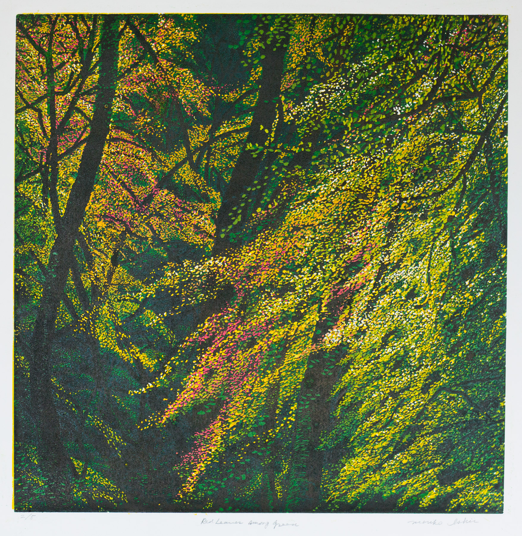
Red Leaves Among Green, 2015
linocut-reduction
24" x 24"
Courtesy of the artist

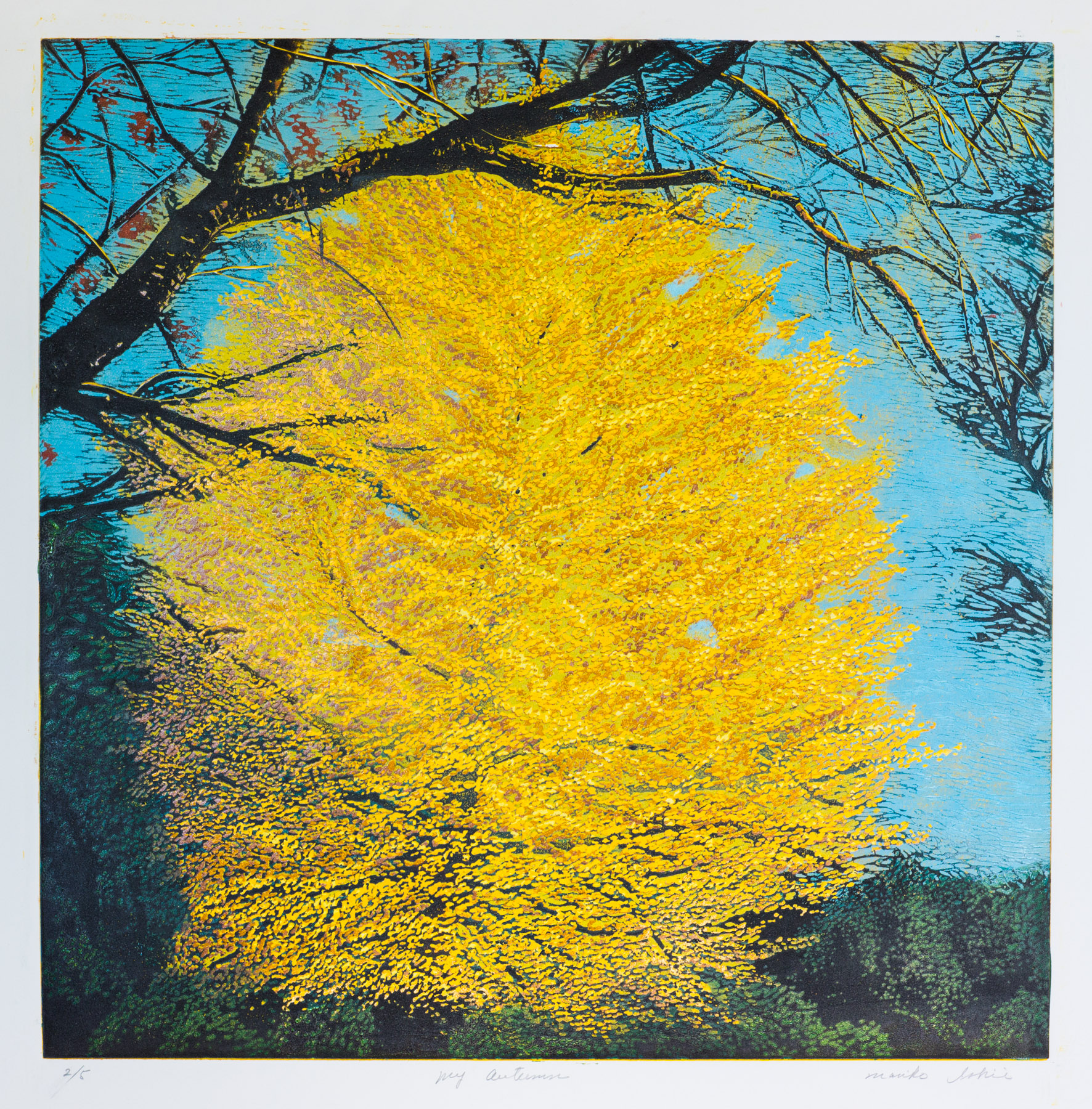
My Autumn, 2015
linocut-reduction
24" x 24"
Courtesy of the artist
Mariko Ishii
I am always attracted to the life of ordinary people and what is ordinary is in my environment.
My work is inspired by the scene having peaceful atmosphere, relaxing me and coming across the simple truth even if it is not peaceful or comfortable.
Many of my images are derived from my daily life, traveling and literature.
Julienne Johnson
Bangkok Boogie began with archival inks on Arches paper in the form of an inkjet print, made from a photograph of Dance — an earlier painting, created against the backdrop of the Thai revolution of February 2014. The Arches paper was collaged on a board. Bangkok Boogie then began its journey, beyond Dance, to a further exploration of the underlying sensations of the conflict that enfolded Thailand during my stay. Warm earth tones contend with cooler hues, associated with the privileged. Bits of common fabric are incorporated, and ink from Thai papers is embedded in the paint as transfers that vie for space with Chinese ink and other media. As the piece developed, I recognized feelings in the emotional landscape as familiar, inevitable to each of us when we leap beyond what we know, to what we do not — even as it promises hope. I see the influence of my study of Chinese calligraphy and brush painting, although no brushes were used in either artwork. Only my hands and various small sticks. Dance, which ended where Bangkok Boogie began, was accepted into the permanent collection of Ratchadamnoen Museum, Krabi Province, Thailand and is on permanent exhibition in their International Gallery.
Bangkok Boogie, 2015
mixed media with pigment transfers and collage
32" x 43"
Courtesy of the artist

Sheri Inez Kotowski
For 57 years – almost 58 years – I have taken every chance, challenge, even dare that has been offered up. My experience lies in the things I leave behind.
I can easily navigate between the 2- and 3-dimensions and from time to time, even between heaven and earth. However, it is at the 'edge' where we advance and retreat to catch a glimpse of the abyss.
Tension lies at the 'edge', this place where the physical meets the spirit, where inside meets outside, light passes to dark and to light again. The 'edge' is ever present sharpening and then falling away, and ever as inarticulate as is the tideline. The consistent motion of the earth and the sea, tumbling and roiling, defines delineates and qualifies what is there and what is somewhere invisible, bound in it’s own nature to perpetuate. It is the place that lets us into another realm.
Estrella de las Tres Puntas, 2015
from the Black Magic Stars Series
Black Magic ink, India Ink, gesso and bee's wax on paper
22" x 22"
Courtesy of the artist

Eiswand I, 2014
ink and acrylic on canvas over panel
11" x 11"
Courtesy of the Artist

Diaspora, 2015
ink and acrylic on canvas over panel
11" x 11"
Courtesy of the artist
Kerry Kugelman
As a painter, using ink and acrylic media has allowed me to explore and expand the range of expression open to me as an artist. Now an integral part of my process, ink continues to reveal its ability to suggest and convey new worlds of organic textures and luminous atmospheres. In these mysterious landscapes I continue to discover new aspects of time, history, and memory, and the sublime power of nature.
Kerry Kugelman is a Los Angeles-based artist, and has an MFA from Claremont Graduate University. His paintings have been exhibited throughout Southern California, and are in numerous private collections. His writing has appeared in local art publications, and he has taught at universities and colleges throughout the Los Angeles area and the Inland Empire.
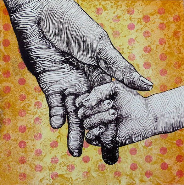

Mako Lanselle
My inspiration for this series of prints came from how fully a person’s hands can
express feelings.
Imagine how mimes convey messages through their facial expressions and body language; the positions and gestures of their hands has a lot to do with how they communicate with the audience. I wanted to convey the warm feeling
hands can express.
I am primarily a printmaker. To create the image of each work I use methods such as silkscreen, lithograph, intaglio, relief, monotype and others.
I strive to be consistent with my original intuitive approach to make art that
emits soothing feelings.
Reassuring, 2015
lithograph
12" x 12"
Courtesy of the Artist

What it means to be an American has been a core question in my life and work. I lived my first 10 years of life in Philadelphia, not far from Independence Hall in an Eastern European melting-pot neighborhood. I began my art education in Philadelphia at the Pennsylvania Academy of the Fine Arts, which greatly influenced my thinking about the content of my work.
The focus of my work has always been to depict something about the American experience, no matter how ordinary, and to say it in an aesthetic manner.
The enjoyment of color, composition and consideration of tactile surfaces all need to marry with the content. That being said, I sometimes will create a piece for its pictorial qualities in and of itself, sometimes for the technical challenge a visual idea may pose. Elements of the way things sound and smell are also meaningful to me. Visual images should bring about the ‘at onceness’ experience that we all know and understand in an instance.
The Organs, 2014
color wood blocks
15" x 45"
Courtesy of the artist
Anthony Lazorko & Edgar Ivan Rincon

Carolyn Liesy
I am currently working with less traditional approaches to printmaking. My work is not editioned, but neither are they monoprints: I use plates. I am interested in making prints that resemble abstract paintings, while at the same time being prints. At times, I use Mylar as a substitute for paper. I am also exploring value and depth. As far as the conceptual element beneath the work, I am always experimenting. I am interested in impermanence, not in the sense of decay, but of change—ongoing flux.
Life Unfolds Out of Our Control, 2013
collagraph on Mylar
40" x 30"
Courtesy of the artist
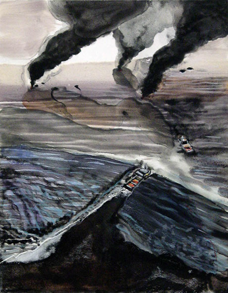

Linda Lyke
I use printmaking strategies, particularly the monotype, in unique ways. I embrace the flow of printmaking by sketching through and around the co-mingling of solvent and ink. By allowing my process to directly inform my imagery, I find that printing with ink and color is really a process of discovery.
A continual source of inspiration for me is the collision of man and nature. This monotype, Death by Fire, is one of a series entitled Destructive Beauty that focuses on human disasters to the environment. In these pieces, I explore the energy and emotion inherent in events like wildfires and the Gulf Oil Spill. With this piece, I want to convey the turmoil of a raging fire caused by a manmade disaster. When you first look at the piece, you see a striking vista. The way the fire and smoke interacts with the sky and ocean to create patterns of light and dark is objectively beautiful.
However, it’s a grotesque beauty because Death by Fire references the killing of small turtles and other ocean life during the after burns. After burns are an accepted way the oil industry ‘cleans up’ after a spill and involve corralling everything with floating devices to burn the oil off the surface of the water. No effort was made on the part of BP to save the small animals trapped in the oil slick before igniting the oil. The epic feeling of the piece symbolizes the significance of BP’s indifference to the ocean and its animal population.
Death by Fire critiques the oil industry’s inability to truly fix any spill in the environment. The disregard for marine life and the environment is unconscionable. By using the monotype, I can evoke this unsettling realization through the use of dark, foreboding plumes of oil and smoke.
Death By Fire, 2014
monotype and watercolor
22" x 18"
Courtesy of the artist


Mask, 2015
from the Via Dolorosa Series
ink and watercolor on Japanese paper
39" x 39"
Courtesy of the artist
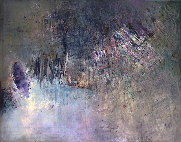
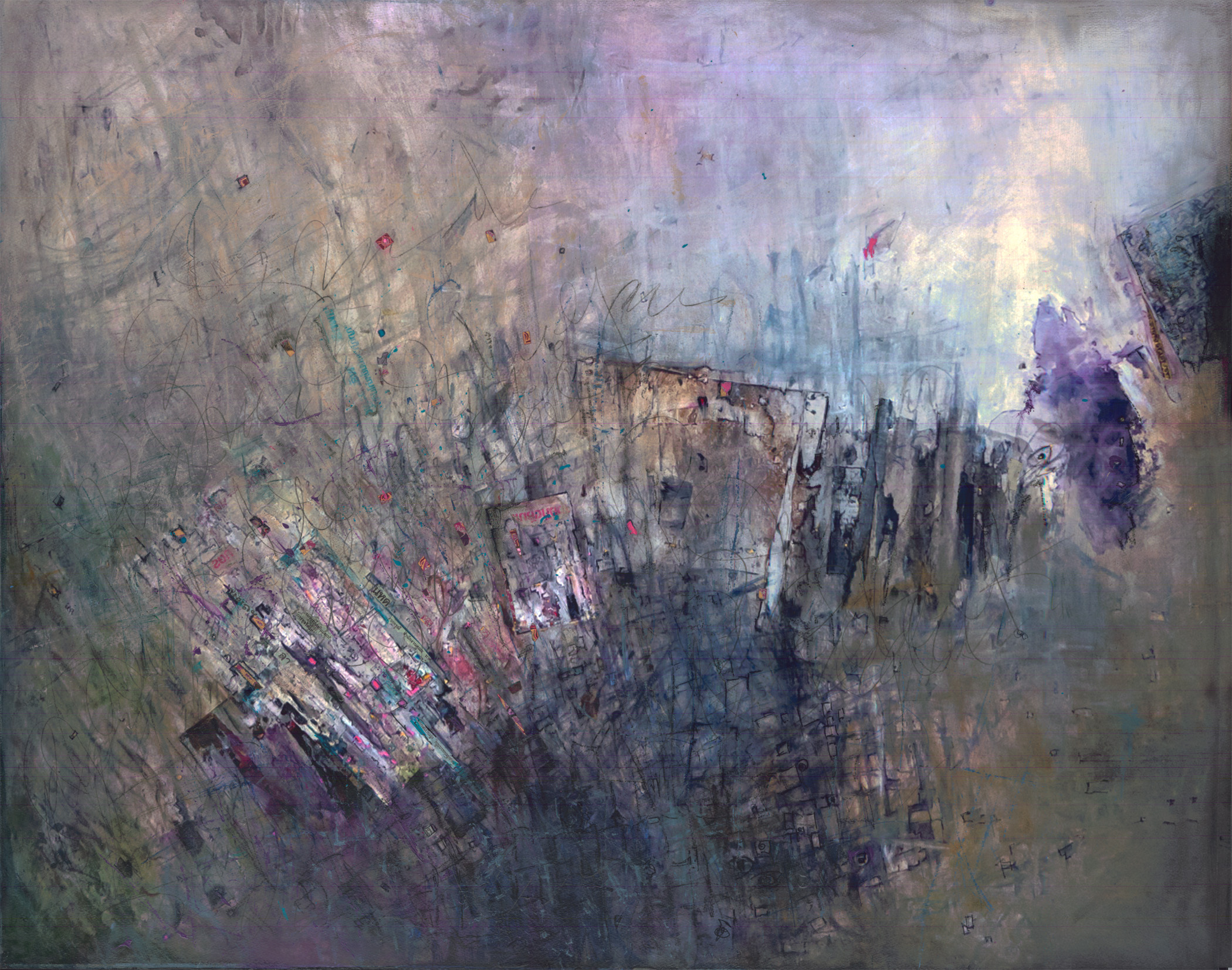
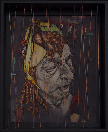
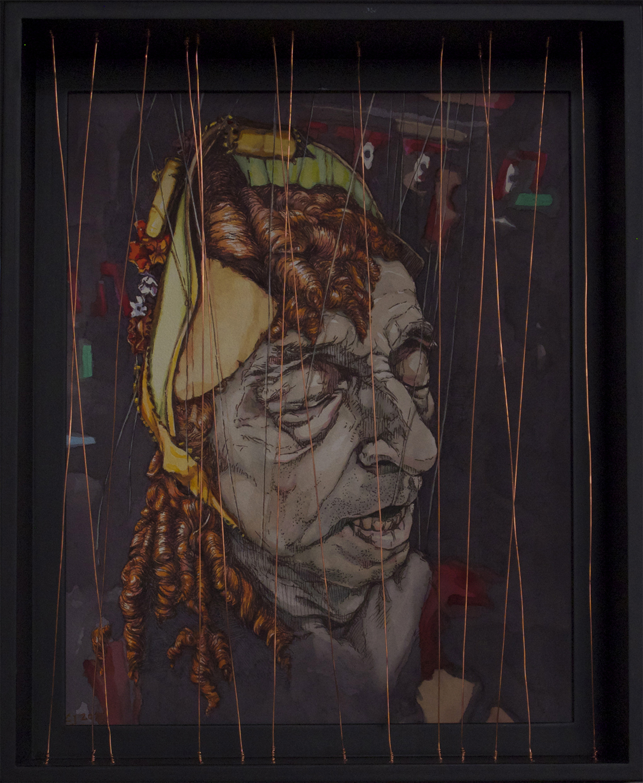
These three pieces exhibited, culled from a current series entitled Via Dolorosa navigate through that conflict. The works arise from looking at ‘life & death + beauty & ugliness’ with no specific predilection or hierarchy assigned to any one state.
CJ Mammarella
What it means to be a human being is a war between emotion and intellect and is a theme that is as expansive as it is common to the question of human meaning.
Dummy, 2015
from the Via Dolorosa Series
ink and watercolor on paper
23" x 17"
Courtesy of the artist
Puppet, 2015
from the Via Dolorosa Series
ink and watercolor on supported watercolor board with wire
11" x 9"
Courtesy of the artist


Saritha Margon
I have become engrossed with symmetries as a way of expressing myself in different media. They are abstractions that mimic life. It is one image that replicates itself and becomes a more complete image. As soon as there are two sides to an image, it becomes organic and recognizable. While I enjoy doing work, I also think the viewer becomes engaged with seeing and puzzling-out recognizable forms, much like in a Rorschach test.
I draw on paper that has been folded in half. I then draw with clear acrylic so that what I draw is not visible. Only when I unfold the paper and let the drawing dry, and proceed to put ink washes over the dried drawing does the drawing become visible. It is both spontaneous and ordered by the symmetry.
Symmetries 34, 2011 (left thumbnail)
acrylic and ink on paper
14.5" x 22"
Courtesy of the artist
Red Ink, 2012 (middle thumbnail)
acrylic and ink on paper
11" x 15"
Courtesy of the artist
Gray #4, 2012 (right thumbnail)
acrylic and ink on paper
22.5” x 29”
Courtesy of the artist
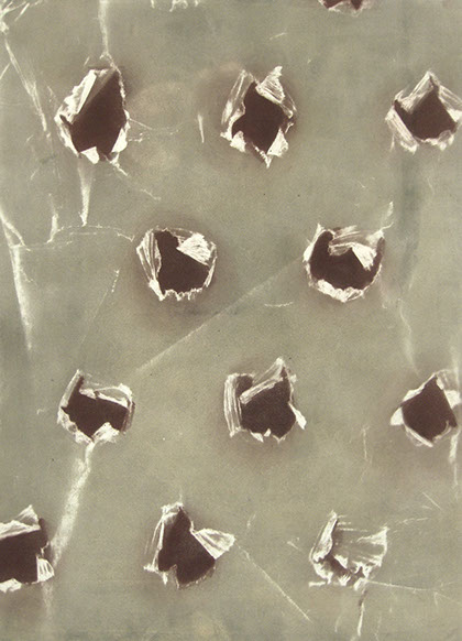
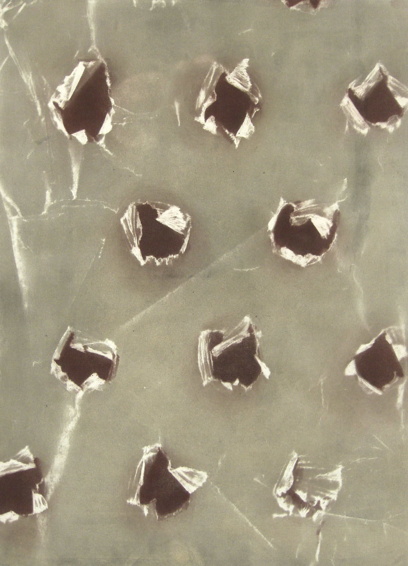
Rebecca Marsh McCannell
This print was inspired by a scrap of waxed paper that had been punctured with a pencil, leaving a surprising variety of creases and torn openings. I enlarged the scale of the image to draw attention to the subtleties. I tried to suggest the translucent quality of the surface by using selective inking techniques as I printed the intaglio plate.
Pierced, 2013
from the Paper Holes series
intaglio with a la poupeé inking
24" x 18"
Courtesy of the artist

Kay Marshall
My work is very much driven by the process of painting, printing and collage. It reflects my interest in memory, impermanence, and the relationship between opposites such as order versus chaos, structure versus gesture, and line versus form.
I try to develop levels of meaning by building and/or removing layers of paint, ink, paper and other materials. Each piece has its own history, which is partially revealed through various layers. They are images and marks contained in layers of space and time.
Tell Tales, 2015
monotype and graphite
11" x 11"
Courtesy of the artist


Kimiko Miyoshi
The recent focus of my work is to transform insignificant objects into something visually striking, and to invoke a renewed curiosity in the viewer, thus providing a perpetual amusement in their life. In Science, older discoveries are constantly replaced by new ones as new tools and technologies become available. That is 'progress' that benefits humankind. However, as a visual artist, I find the artifacts and documentations of out-dated researches fascinating.
One of my current themes is the discovery of the canals on Mars and how the idea was fostered. The subsequent discoveries with more advanced technologies condemn the earlier astronomers as phony or bogus amateurs. During my artists residency in Toronto, I wanted honor those astronomers, such as Percival Lowell, with my print project. There were constructions everywhere in Toronto. While listening to the constant construction noise, I imagined the tools that Martians used to dig their canals. Lowell imagined Martians are ethically superior to us. They are intelligent and peaceful, being able to work as a unit throughout its globe toward a common goal (Mars and its Canals, by Percival Lowell). The imaginary construction tools are reflected in my layered monotypes, Havoc, and Halt.
Havoc, 2015 (top)
monotype, layered and handworked
21.5" x 15.5"
Courtesy of the artist
Halt, 2015 (bottom)
monotype, layered, and handworked
22.5" x 15.5"
Courtesy of the artist

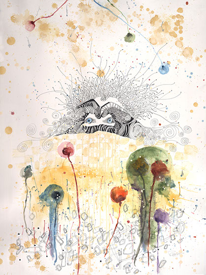
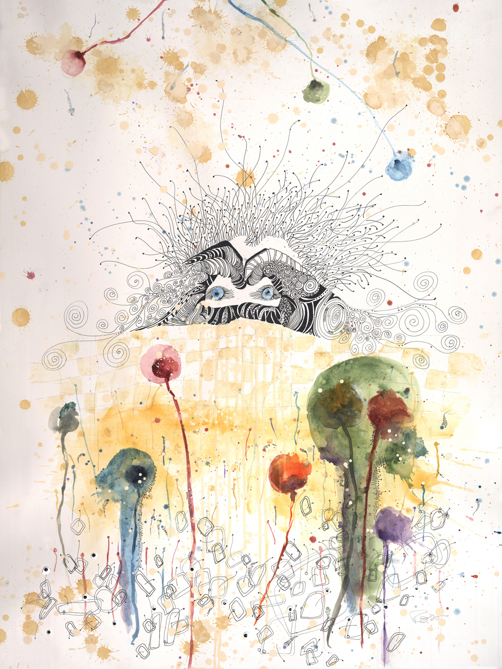
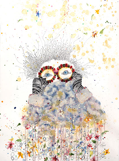
Gail Panske
Rain Voices is inspired by the work of novelist Catherine Chung and poet Lauren K. Alleyne. Both writers explore the complexities of the human condition. Their journeys led me to revisit paths I had walked down before, and to many that I experienced for the first time. Sorting through the complexities of my own journey, often by taking the familiar path the other way, resulted in the foraging of new trails, discoveries and insights. The Rain Voices artworks are part of a larger group of drawings and prints that explore the rain voices that speak to us at different times in our lives.
“In their rain voices,
let them whisper to me.
Let each lived moment of love
light a path from this world to the next.”
Difficult Fruit, “When The Angles Come”
– Lauren K. Alleyne
“Think about it! The tiniest insect contains infinity on its back: each life contains as much meaning as all of history.”
Forgotten Country
– Catherine Chung
Rain Voices IV, 2015
lithograph, charcoal
33" x 25"
Courtesy of the artist
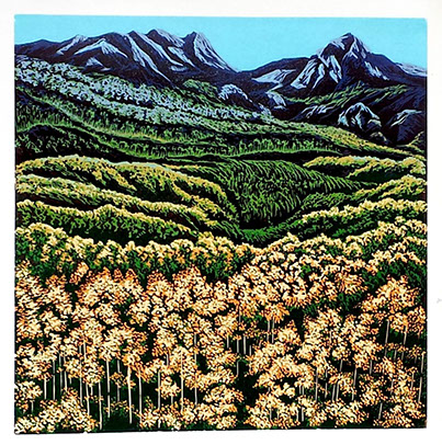
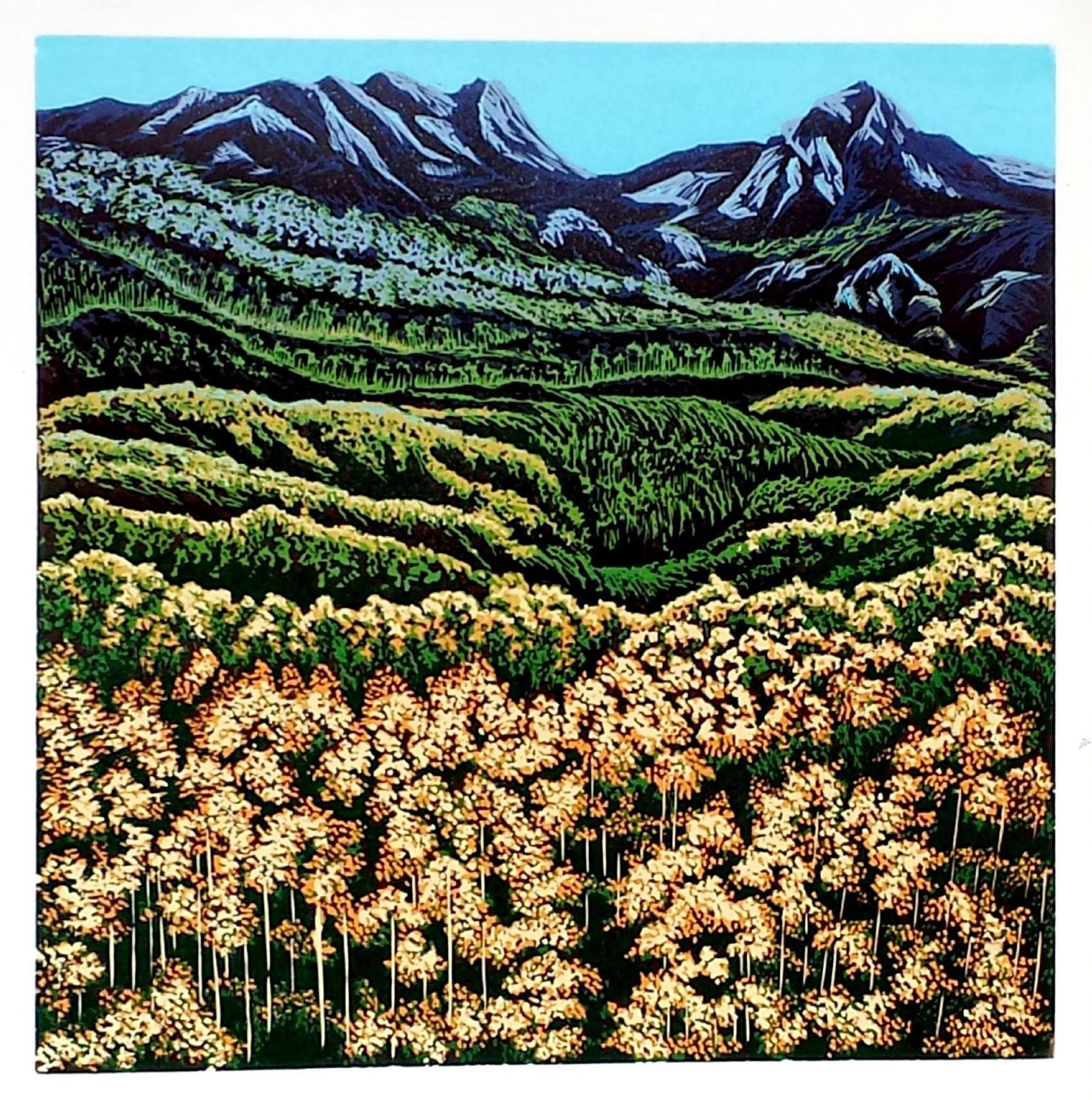
Fall in the Mountain, 2015
linocut reduction
24" x 24"
Courtesy of the artist
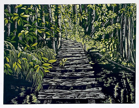

Walk in the Woods, 2014
linocut reduction
18" x 24"
Courtesy of the artist
Varsha Patel
Patel grew up in Mumbai, India. She was inclined towards drawing and the arts early in her childhood, but had to manage with limited art supplies. After high school she attended an arts college in Mumbai and graduated with BA degree in fine arts. There she learned oil and watercolor painting, charcoal and pencil drawing, batik design and life drawing. After graduating, she migrated to the US and worked in the financial industry for several years. In her spare time, she did some paintings and arts and crafts. After she stopped working in the financial industry, she took several classes in printmaking at Saddleback College in Mission Viejo, California. Here she focused on linocuts, woodcuts and intaglio, and developed a passion for printmaking. She concentrated on relatively large specialty reduction linocuts and successfully entered her creations in several leading art galleries and shows. Many of her creations were front covers and inside pages of Saddleback College publications, Wall Magazine and Flex booklets.
Her work is inspired by vibrant colors in nature, and some from her imagination. She often get ideas from photos and use her ideas and drawings to finish her work. Some of her woodcut and linocut prints are her imaginary flowers and gardens. Some of her etchings come from her Indian heritage.
The reduction method is a printmaking technique used to create a multicolored print with the use of a single block. For each color pass the artist removes more material from the block. Color will not transfer from the block to the paper where the material is removed so the image of the removed material will preserve the color used in the previous pass. Each color is printed on top of previous color. The artist must print the entire edition before going to the next color pass. The image slowly emerges while the actual block is destroyed. A reduction print can therefore never be reprinted. Patel’s reduction print editions are always either five or six prints.

Kristen Powers Nowlin
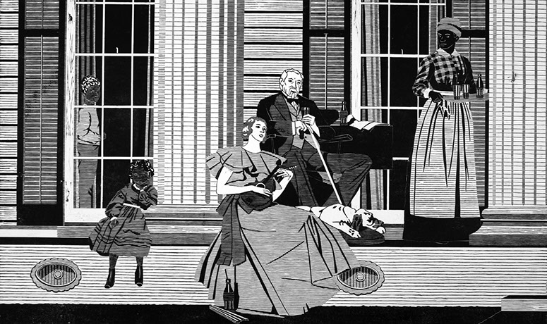
For many years, my work has explored how American culture defines and determines race. In the past, my artwork has represented the various ways that popular, scientfic or academic cultures have used to identify the race of a given individual. Skin color, hair type and color, facial features, and bloodline have all been explored and exploited as ways to include or exclude people from one category or another.
My current body of work, The Land of Romance Series, responds to images used in print advertisements of the 1930s, including Norfolk and Western Railroad travel brochures promoting Virginia as “the land of romance, hospitality, and beauty”; other travel brochures carrying the slogan, “Carry Me Back to Old Virginia”; and Maxwell House Coffee ads.
The original, idealized images that these advertisements featured are challenged and expanded in the black and white woodblock prints, perhaps showing a more accurate reality. Research into many African-American family trees can reveal multiple generations where children were born to slave women and fathered by slave owners. This history played a significant role in shaping America, both economically and socially, and has had a lasting impact on both individual families as well as America’s complex social fabric.
Delicious and Refreshing: The Sign of Good Taste, 2014
from The Land of Romance Series
woodblock print on paper
42" x 66"
Courtesy of the artist
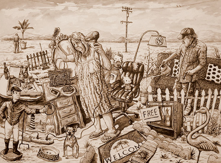
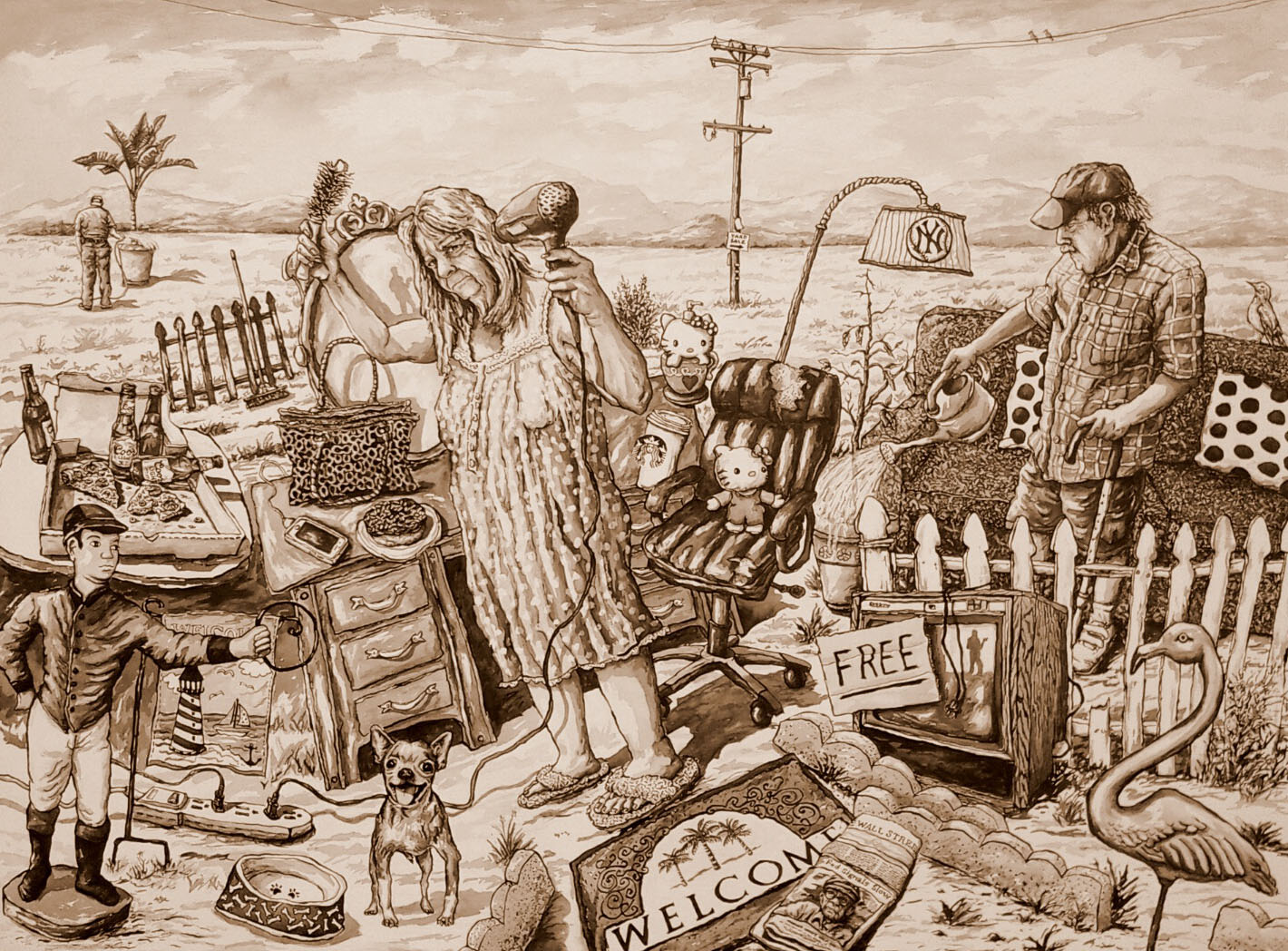
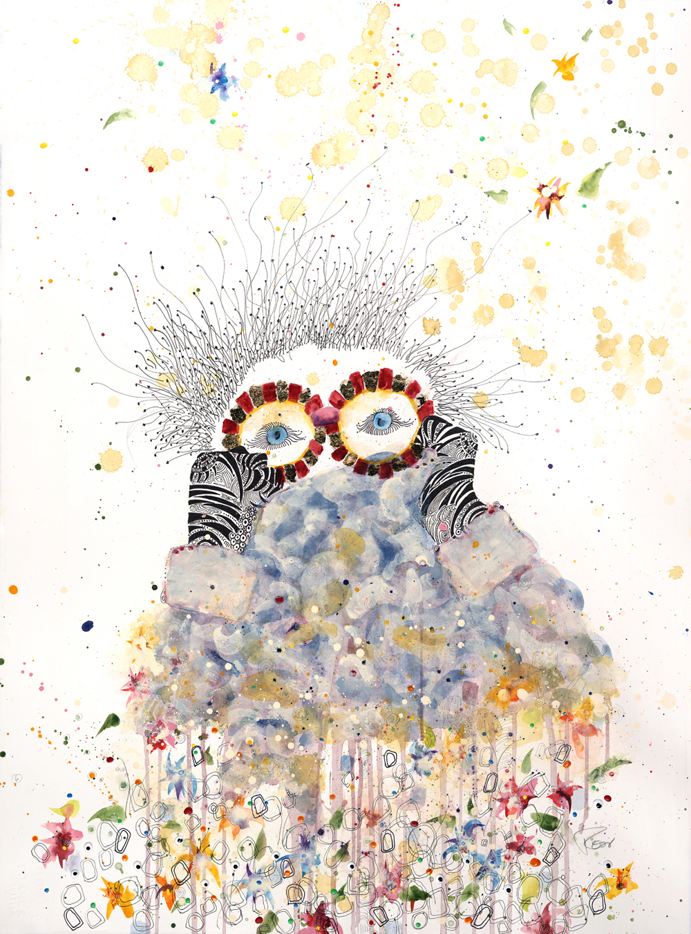
Jeff Reed
As artists, we are always making observations: trying to create what we see into a new invention, using skills and imagination to make expressive marks in time. I am not making judgements about what I see, just observations, hoping I make something worth looking at. Observations of life in the suburbs of Southern California was the inspiration for All Kinds of Truth.
All Kinds of Truth, 2015
F.W. ink on wood panel
36" x 48"
Courtesy of the artist
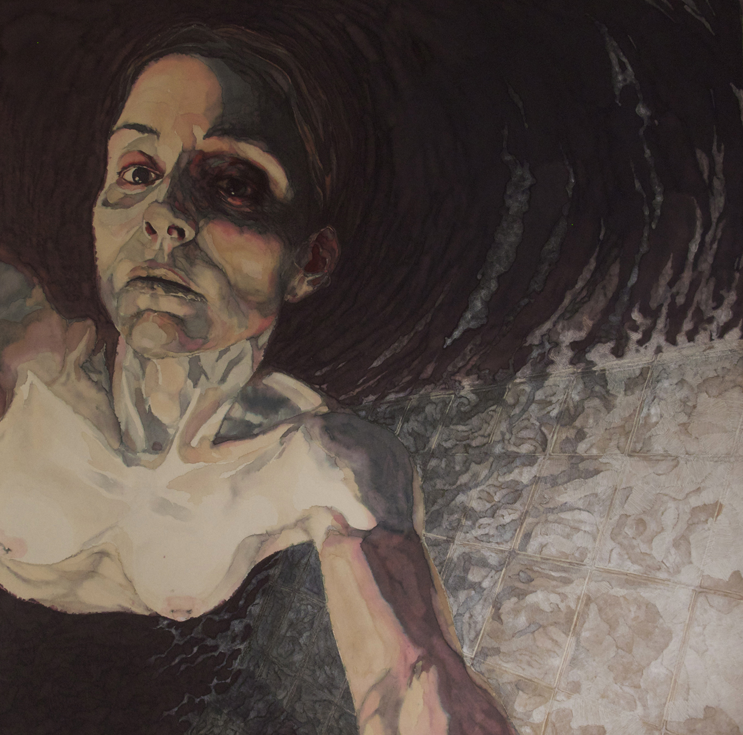
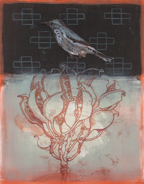
Karrie Ross
When I was four years-old playing in my front yard, we lived in one of those pre-war track homes–3 bedrooms and a 4’x4’ porch–in Southern California. It had newly planted green grass and a beautiful pink crepe myrtle tree in full-bloom. All of a sudden my mom runs out of the house yelling, “EARTHQUAKE!! Get in the house.” And at that very moment, a bee flew down my blouse. How much more surreal can it get?
This is my first recollection: a fascination with the juxtaposition of situation and parts. This has continued to expresses itself in my art. This work explores the disconnectedness of my thoughts—so I like pushing and pulling the tension using ink and paint…I create the cause of the risk within the 'watching the paint dry' —anticipation.
Karrie Ross, native to Los Angeles and a self-taught visual artist, shares her explorations into concepts of energy, science, participation, making-an-impact, creating internal and external conversations, and ‘being seen’, as the underlying influences of her art.
“There is FUN to be found in everything we do. So be sure to develop a pattern of creating conscious play, that will stay with you forever.”
Watching the Pods, 2013 (left)
ink and watercolor
30" x 22"
Courtesy of the artist
Peeking at the Unknown, 2013 (right)
ink and watercolor
30" x 22"
Courtesy of the artist
Dark Money, 2014
silk screen ink and paint on paper
25" x 58.75"
Courtesy of the artist
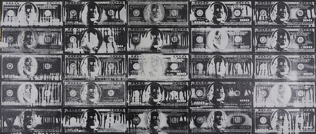
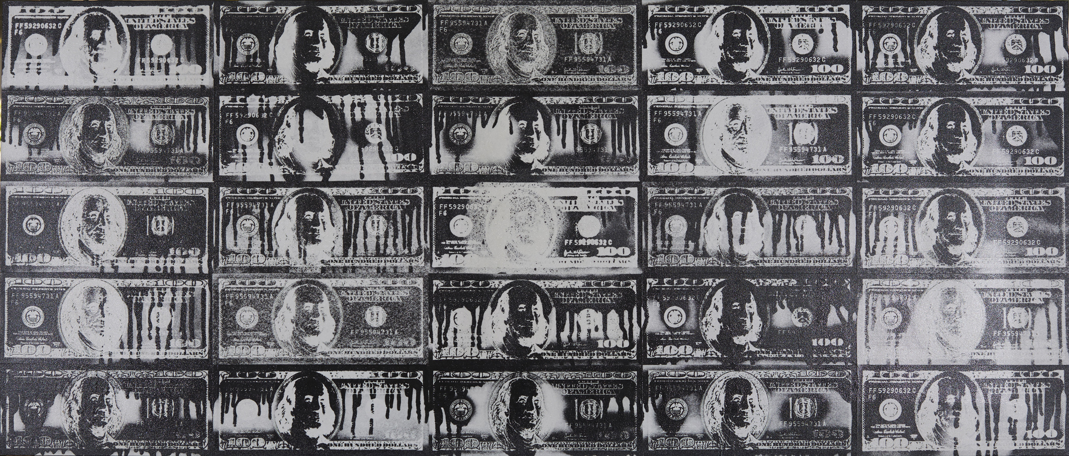
Howard Steenwyk
The contemporary ‘American Experience’ is a consumer driven environment in which our values are deceptively advertised as wholesome qualities of ‘The American Dream’. Concepts of packaging, branding and marketing have permeated our culture and language where interpersonal relationships have become commodities within social media to defi ne status. My current work involves colliding images and techniques producing a new piece with content each individual component does not possess on its own. The conceptual and visual contrast expresses the divergent forces that shape the American Experience.
Dark Money is produced with silkscreen ink and aerosol paint on paper. The images are screen-printed with black silkscreen ink backwards on paper. The printed side of the sheet is painted with an aerosol can to various degree and position. The unprinted and unpainted side of the sheet reveals the paint bleeding through the paper where the screen printing didn’t block it out. Individual pieces are arranged and mounted to board.
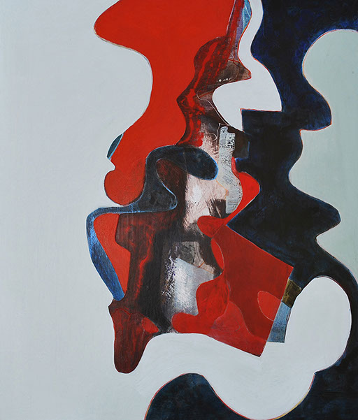

Sophia Tise
Force of Nature is part of a series of exploration and awareness of the changes in the landscape.
Abstract curvilinear shapes carve-out a rocklike three-dimensionality in my pieces. Rich colors in acrylic paint and India ink conflict with the areas that are translucent, allowing marks and textures to come through.
Through studies and photographs of decaying leaves on the ground, in particular eucalyptus leaves, I feel a sense of something organic happening in my shapes: my work is reflecting the natural world, even at its most abstract.
These sensual, organic forms reflect the liquid beauty of life–a suggestion of invented landscape–creating a descriptive, visual narrative, filled with raw emotion.
Force of Nature, 2013
acrylic and India ink on panel
24" x 20"
Courtesy of the artist
Noriho Uriu
My art is an imprint of my observation, feeling and thoughts from daily life. In my work, I have been exploring the combinations of various printmaking methods, such as intaglio, relief and monotype.
In addition, I have been studying the current phenomenon of stem cell research. It has been very fascinating for me to learn the process of the culture, evolution, and regeneration of the stem cell. My current series of prints are inspired by this. In Rejuvenation-Cell, I created an image by putting two elements together: various stem cell images, like a microcosm; and the silhouette of a female pro file.
Rejuvenataion - Cell, 2014
from the Stem Cell in Art series
relief print and intaglio print, mixed media
18" x 18"
Courtesy of the artist

Peter Van Ael
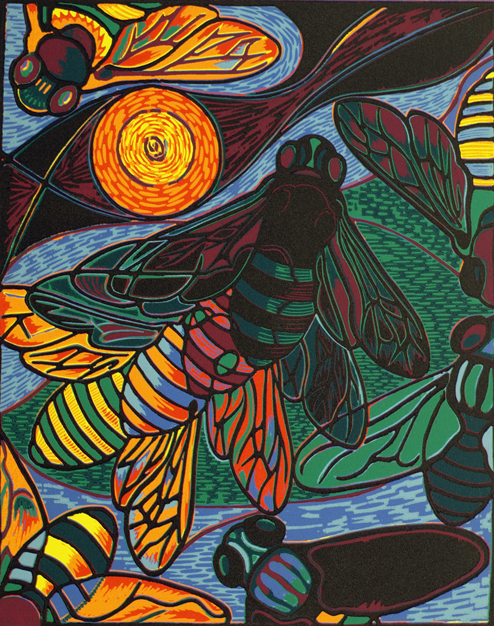
My creative research is informed by my interest in pattern, camouflage, mimicry, layering, and relative scale. I find inspiration both in the natural and human-made world, creating abstract and non-representational works of art that gradually reveal and obscure information in richly textured layers.
Since 2000, I have focused my studio practice on the reduction woodcut. I find its sculptural physicality, in combination with its working immediacy, very appealing. I am exceedingly seduced by its inherent quality requiring the gradual destruction of the matrix during the creation of the work of art. The reduction woodcut print is born out of a creative one-way voyage that provides constant challenges and requires total commitment to any decision made. The reduction woodcut does not tolerate any detours or returns. Consequently, the reduction woodcut is always a unique, fresh, direct, powerful, and honest expression of the artist’s creative intent.
Swarm, 2013
reduction woodcut
20" x 16"
Courtesy of the artist

Folded, 2015
from the Frontline: Detroit series
Sumi ink, India ink, tushe on rag paper
24" x 30"
Courtesy of the artist
Before the Fall, 2014
from the Frontline: Detroit series
Sumi ink, India ink, tushe on rag paper
16" x 19"
Courtesy of the artist
Topless, 2015
from the Frontline: Detroit series
Sumi ink, India ink, tushe on rag paper
13" x 19"
Courtesy of the artist
Margi Weir
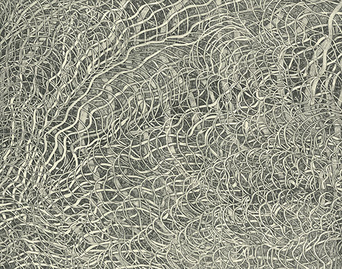
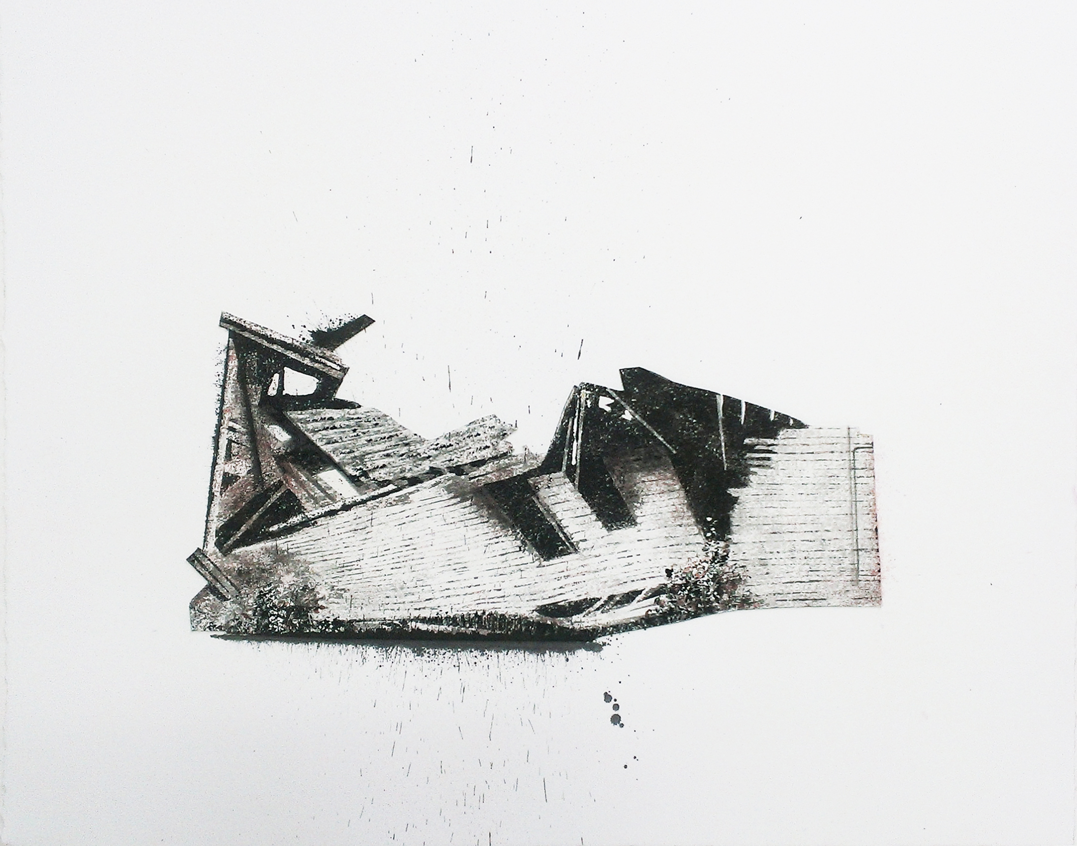
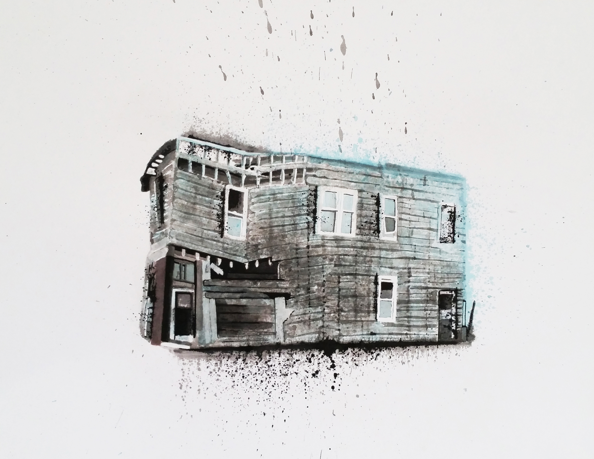
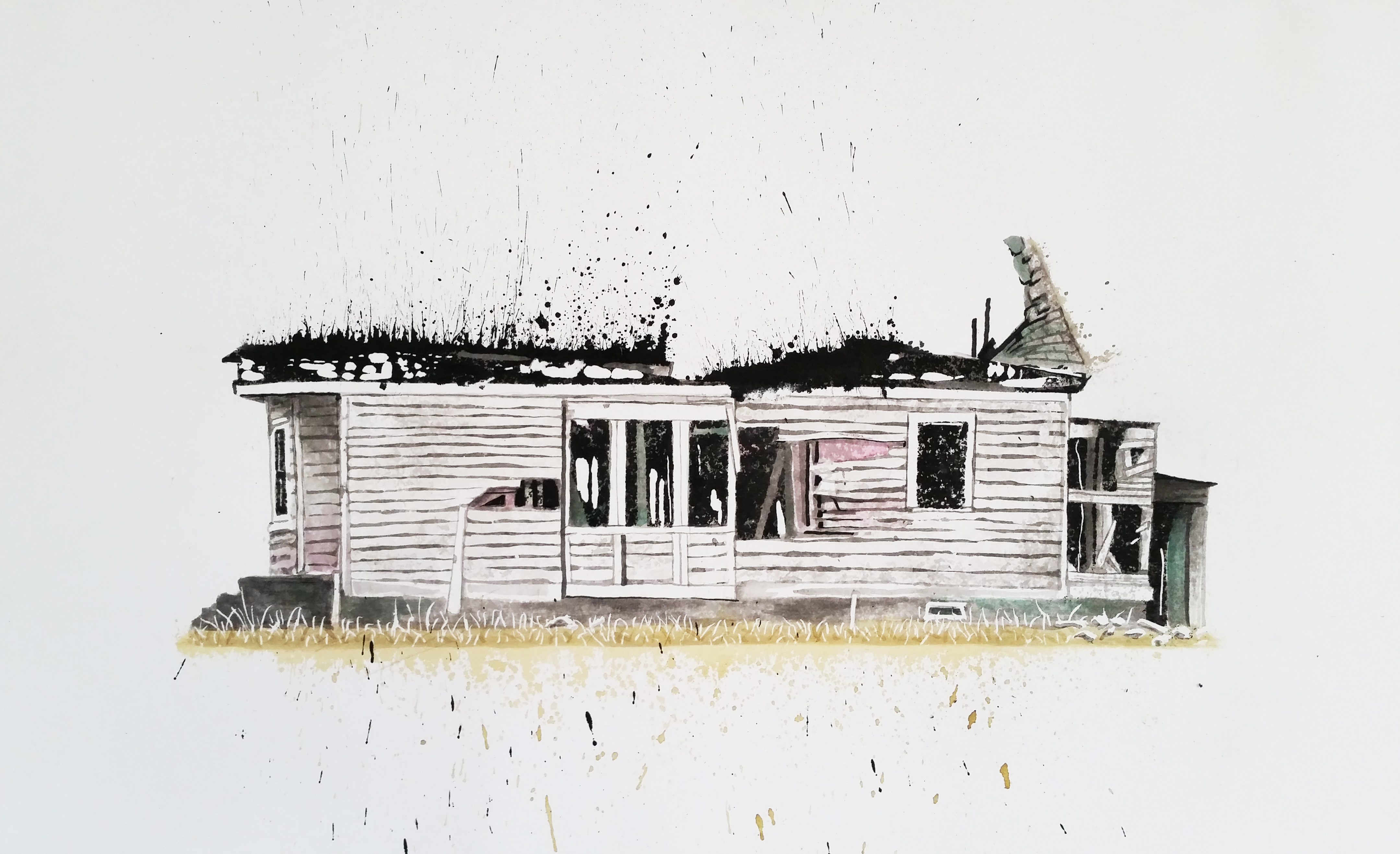
I began making drawings of ink and ink wash about 10 years ago using a technique that I call a ‘snap line’. A ‘snap line’ is the mark made by dipping cotton twine into liquid ink or diluted ink, pulling it tight and snapping it against the paper in an action similar to plucking a guitar string. It is a record of the violent impact of ink with paper. It suggests an event, an explosion, a reverberation, yet the over spray lends a softness to the line quality. I like the idea that something beautiful on the surface has an underlying violence, a dark side, if you will.
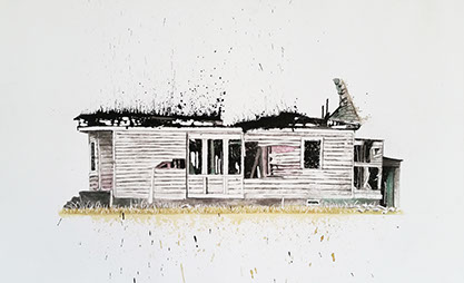
I moved to Detroit in 2009 to join the faculty of Wayne State University. I found, not only Detroit, but the Mid-West in general, to be full of unfamiliar sights and sounds. I was also confronted by the architectural decay that was, initially, frightening. I began to draw these skeletons of buildings to familiarize myself with my new environment. Through drawing, I learn to understand new information. I internalize it and know it in a way that transforms it into something familiar and less frightening. These drawings are fairly large but they are intimate studies of my neighborhood as I become familiar with it. You could say that I am drawing close to Detroit. I have titled the series Frontline: Detroit because I still begin my drawings with ‘snap lines’. I use them to find the main compositional and architectural lines to anchor the drawing.
As I paid closer attention to the urban ruins, I found that they are not only in Detroit. I began to notice them all across the country. There are architectural bones of regional cultures that dot the countryside all along Route 66. There are ruins of motels, gas stations, and actually, whole towns. There are ‘bones’ left from natural as well as financial disaster. So I have expanded the Frontline: Detroit Series to include Route 66 and other cities in America.
Gail Werner
My work reflects the landscape and cultural imagery related to my Native American background. I am a member of the Cupeño band of southern California Indians. Our traditional songs, called ‘bird songs’, and creation stories have played an important role in how I see the natural world. These stories and songs, in which plants and animals are the characters, tell about how the world came to be, and how the people came to be where they are. The ‘bird songs’ tell about the journey of the people, which is said to parallel the migration of the birds. The songs tell about what the birds see: the mountains, deserts, night sky, and other landmarks. Through the use of color, light, Native American rock art designs, and plant and bird imagery, my work evokes a sense of place and journey.
Bird Dreams XIX, 2014
monotype
14" x 11"
Courtesy of the artist
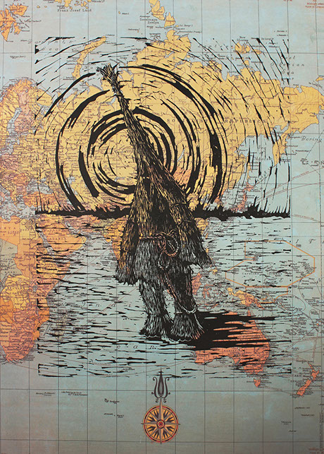
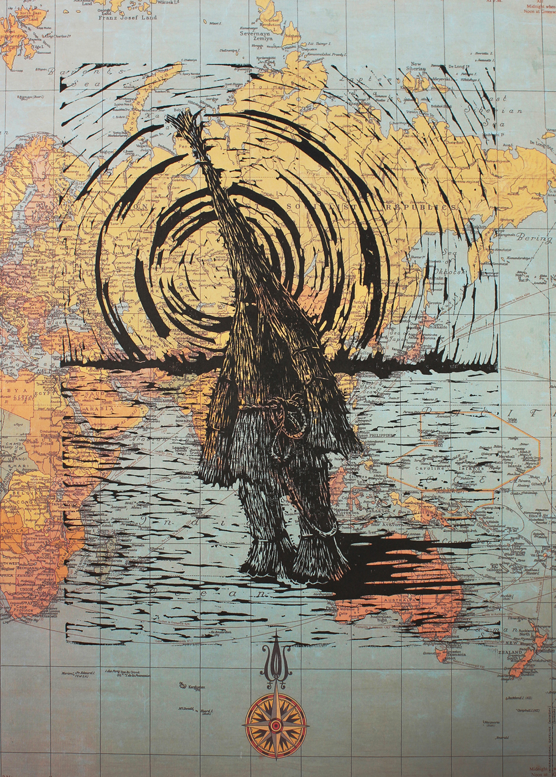
William Wright
My artwork is often narrative in nature, with attention paid to a variety of global issues…the environment, poverty, war, etc. I will often employ the use of archetypal figures to reference these issues.
In Herr Strohmann, the figure refers to the strawman that has appeared in a variety of incarnations: in the folklore of numerous cultures, including Estonia in the 17th century, Croatia, Germany and Ireland, among others. This figure was often used to represent luck, both good and bad, harvests, winter and even death. In this relief print, I have placed the strawman image on a reproduction of an old map, with a blazing sun behind the figure to suggest the inevitable dominance of nature.
Herr Strohman, 2013
linocut, ed. 5/20 variable eds.
16” x 14”
Courtesy of the artist
Avery
Bingham-
Freeman
Brown
Dekel
Escalona
Foster
Furst
Furzer
Gondek
Graves
Hackenmiller
Henisey
Hockett
Ishii
Johnson
Kotowski
Kugelman
Lanselle
Lazorko
Liesy
Lyke
Mammarella
Margon
Marsh
McCannell
Marshall
Miyoshi
Panske
Patel
Powers
Nowlin
Reed
Ross
Steenwyk
Tise
Uriu
Van Ael
Weir
Werner
Wright
<
>
Some artworks are available for sale. Please contact the Gallery at 909-869-4302 for more information.
copyright Kellogg Art Gallery 2015